|
Turner and Duckworth design studio in San Fransisco, have been working hard to create a new visual identity for McDonalds. While still harnessing the branding that we already know and love. The new look includes posters, paper bags, cups, bus stop advertisements, lorry artwork, van artwork, wifi symbols, clothing, loyalty cards and much more. The redesign features a new font developed with Dalton Maag called Speedee, which comes in three weights. As the branding essentially needs to communicate across the world, covering 120 countries and 35,000 restaurants. They focussed on the famous golden arches of the logo and the recognisable gold and red colour-scheme. 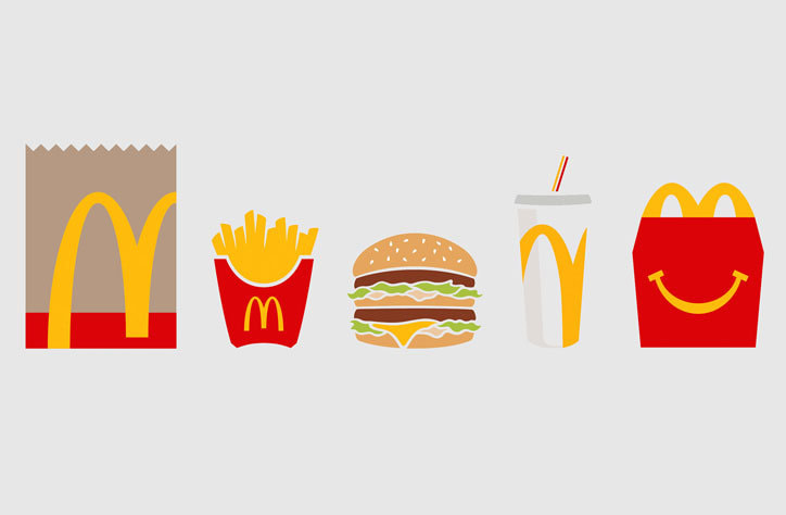 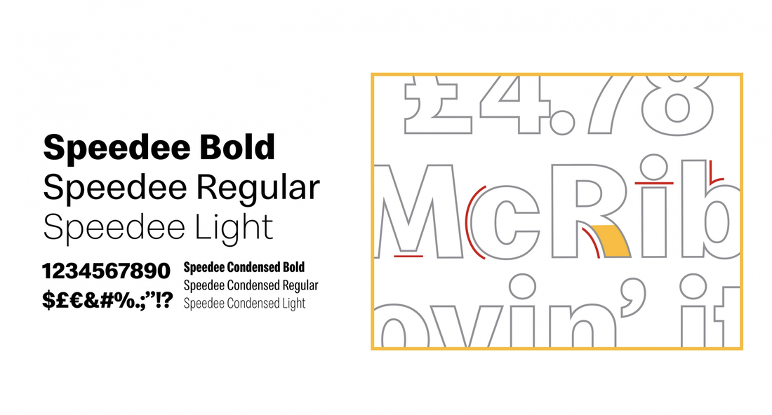 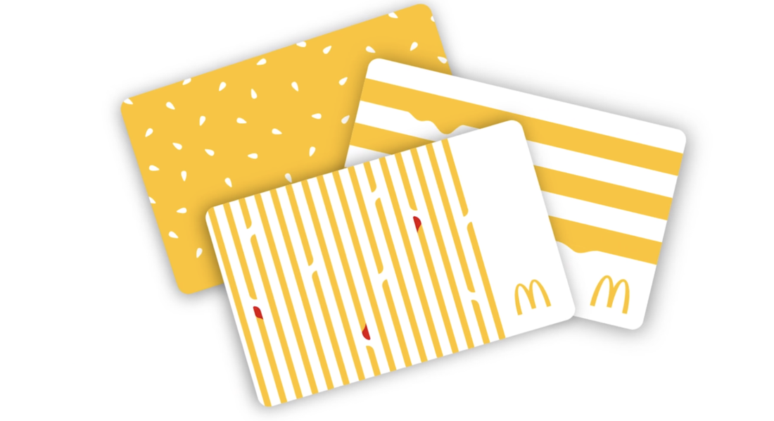 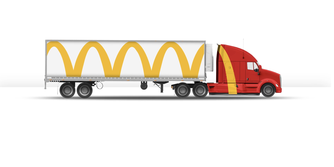 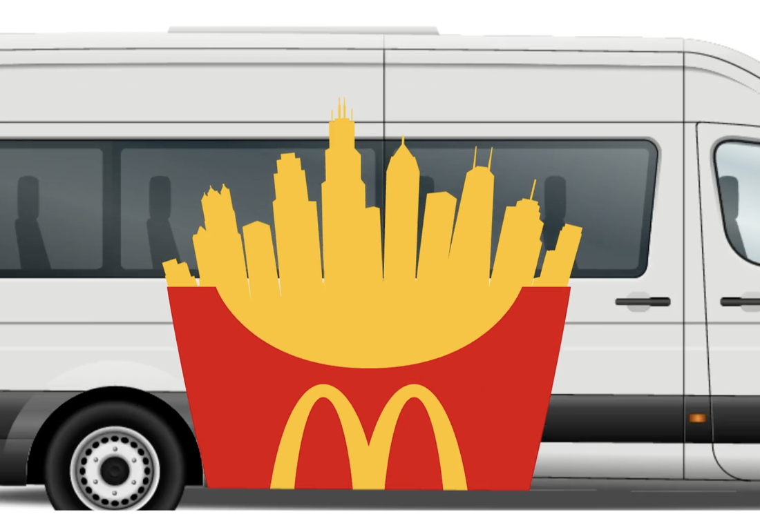 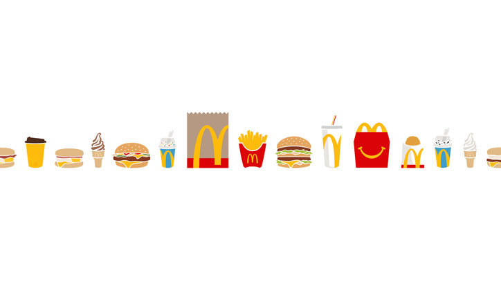
0 Comments
Leave a Reply. |
About me
I am a Graphic Designer and graduate from Nottingham Trent University. This blog is to document my work, inspiration and general things that interest me. Archives
February 2021
|
