|
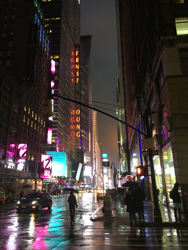
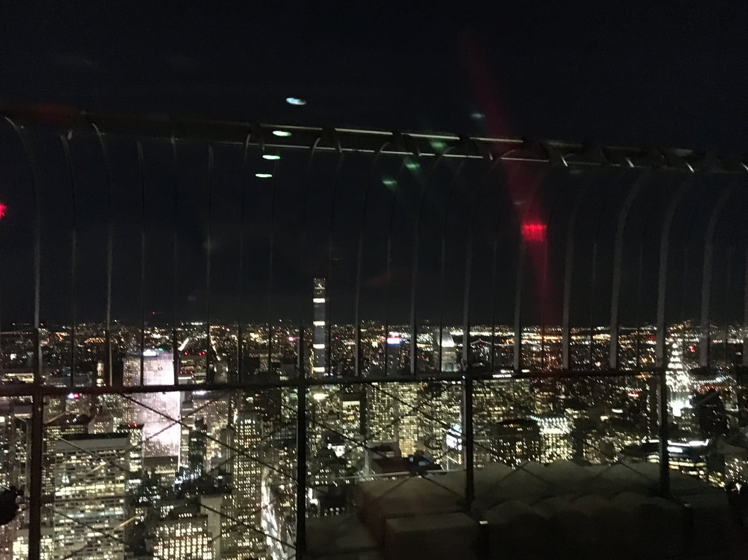
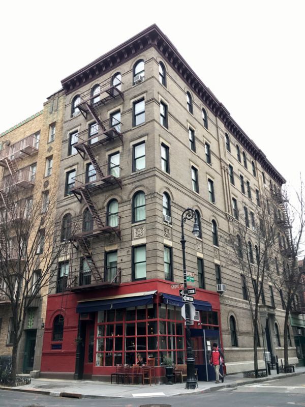
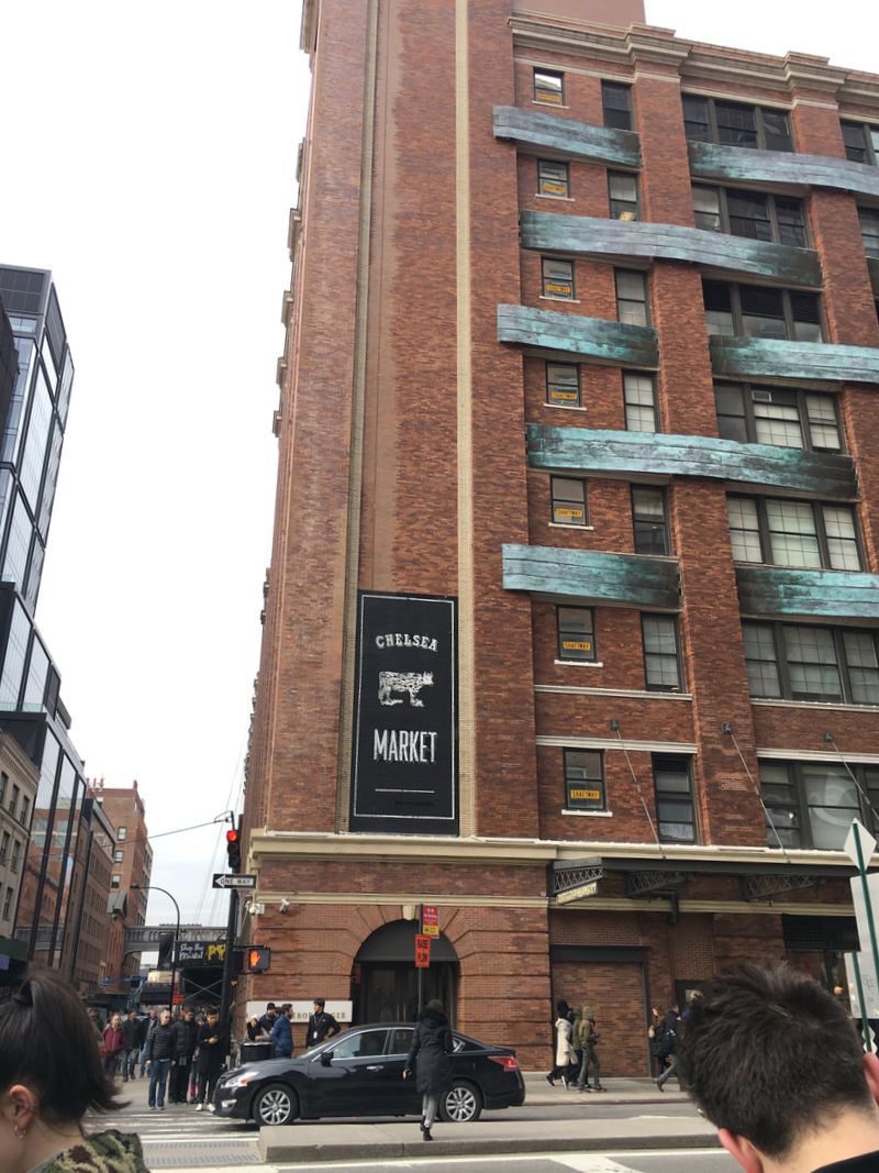
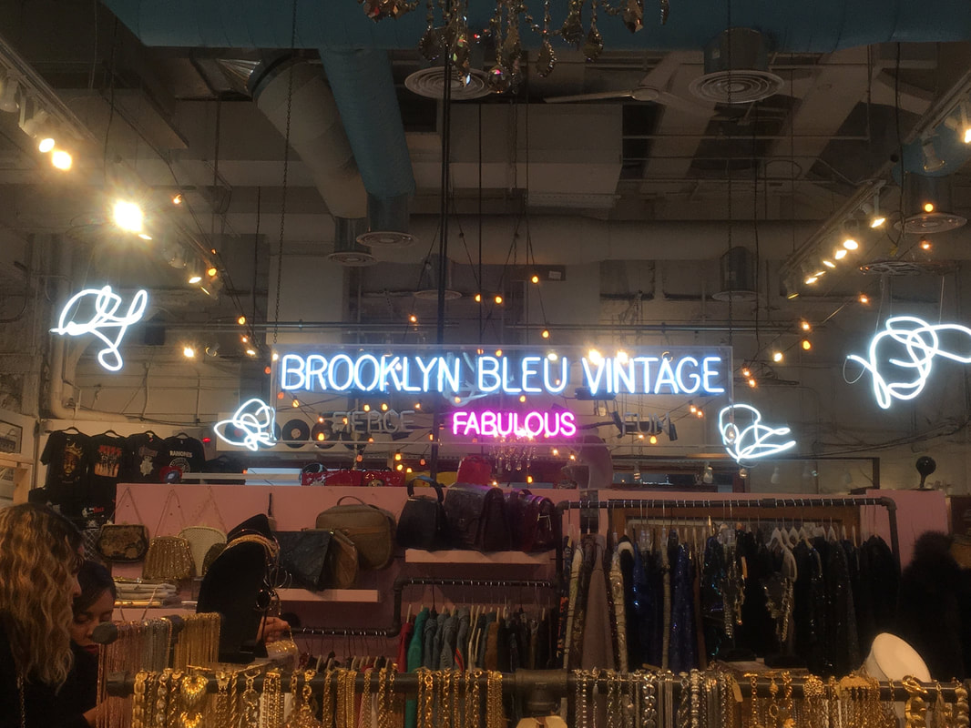
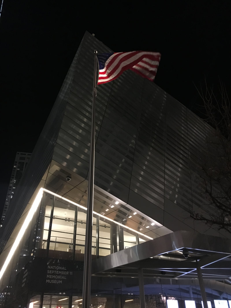
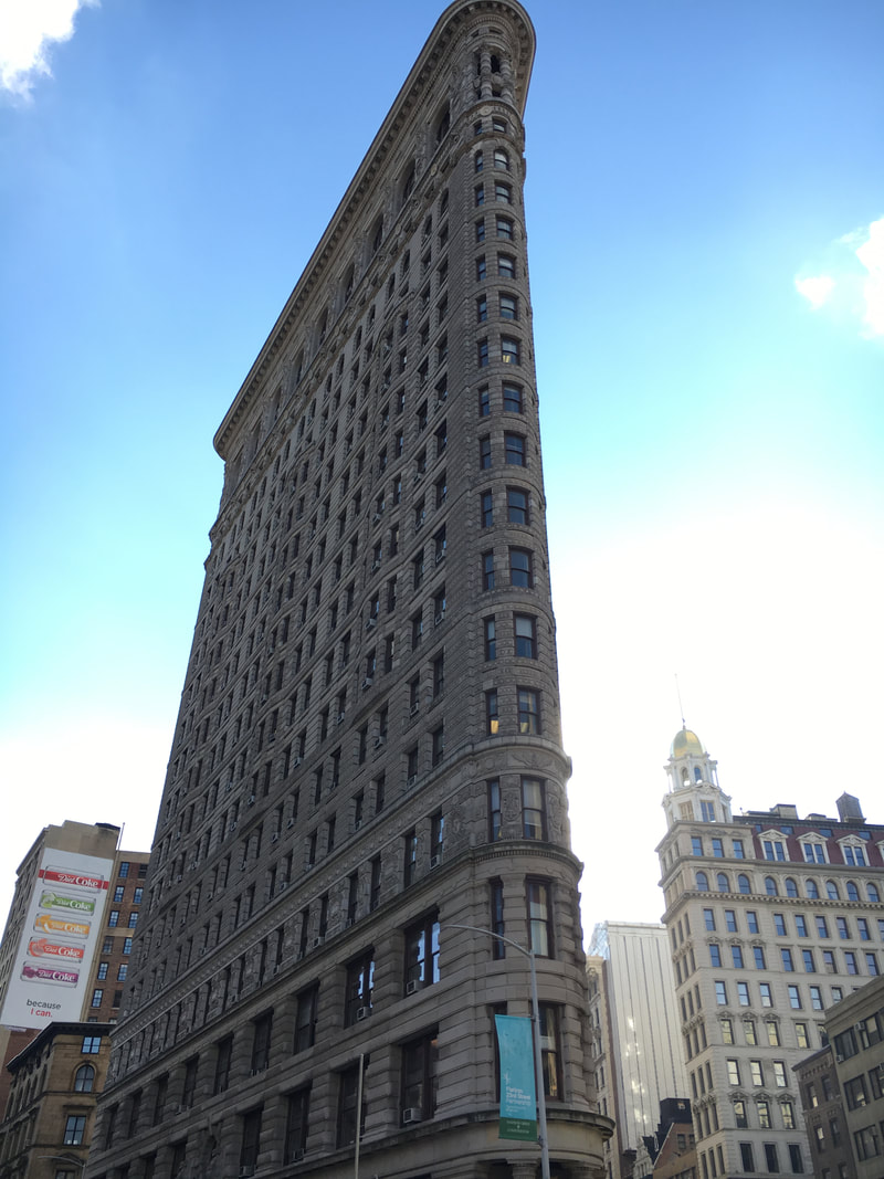
Time's Square Top of the RockEmpire State Building The Friends Apartment Building Chelsea Market Citi Pups Ground Zero The 911 War Memorial The Museum of Modern Art The Flat Iron Building Central Park
0 Comments
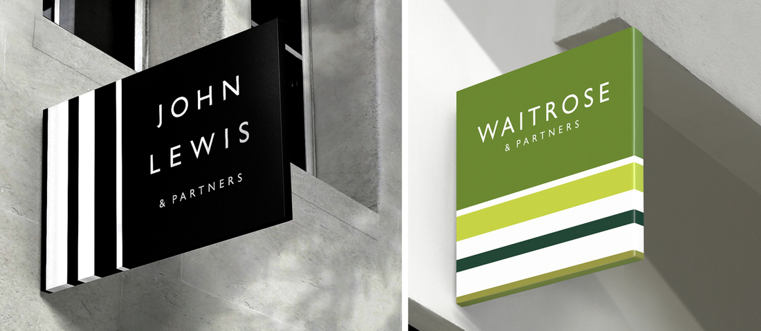
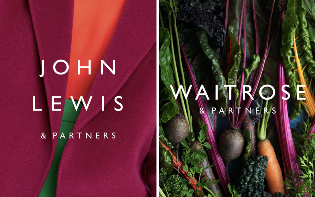
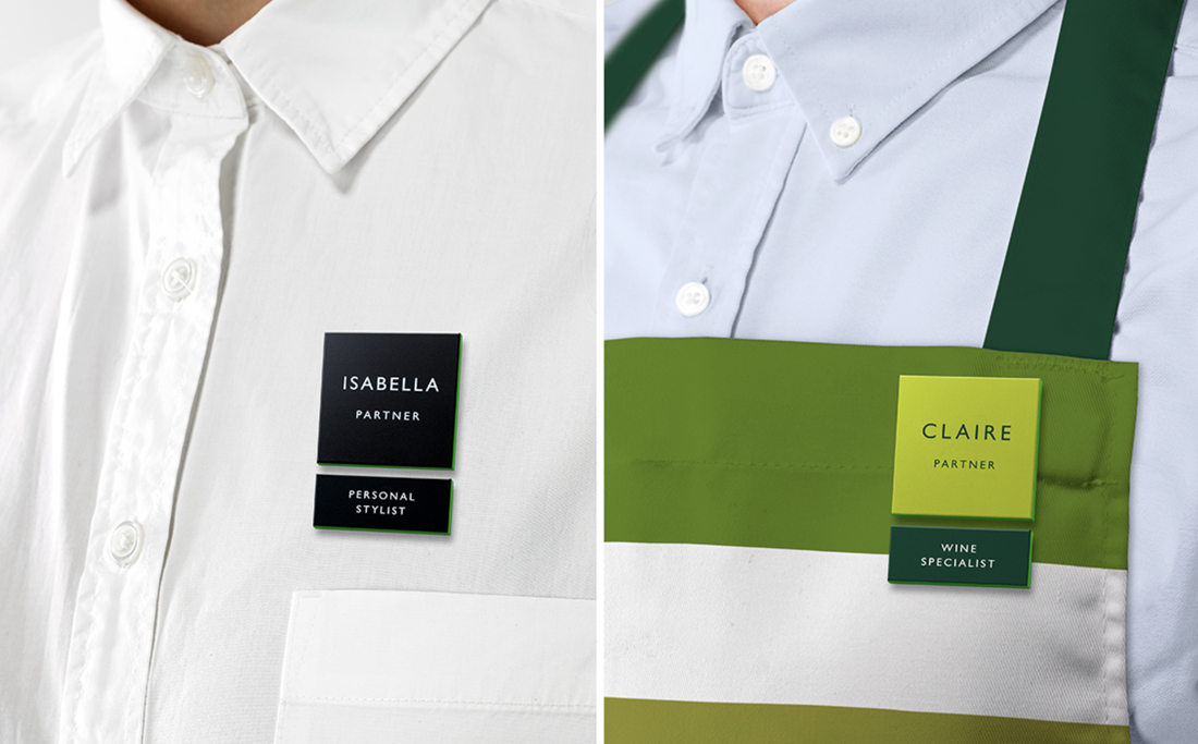
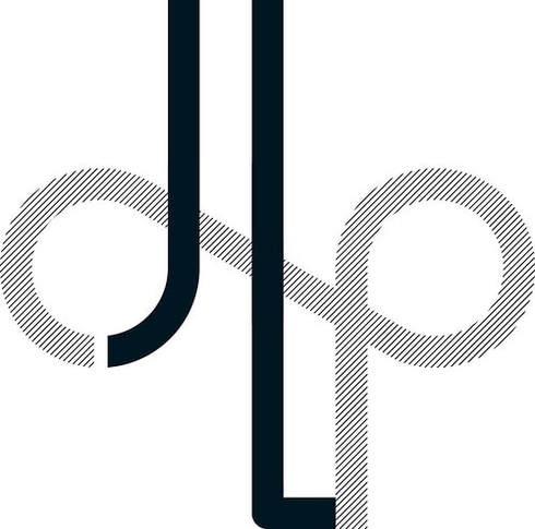
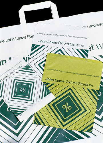
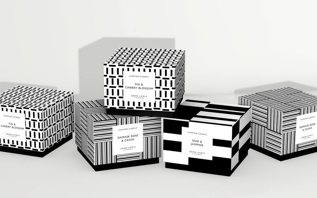
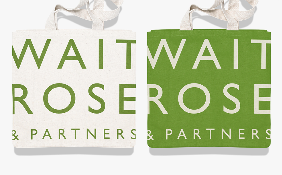
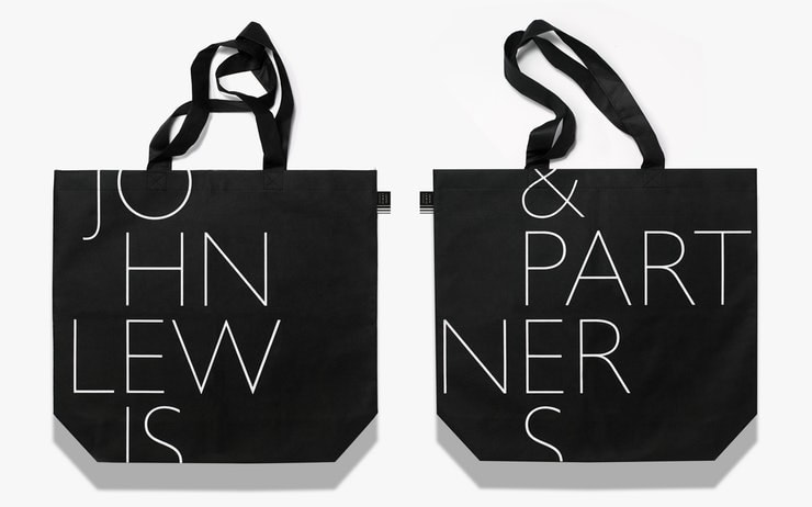
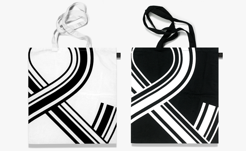
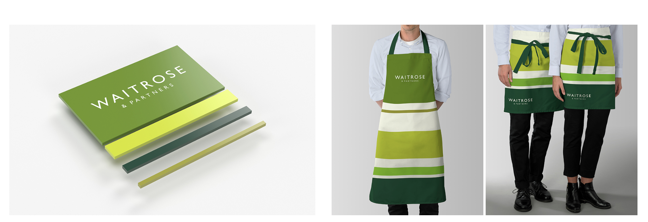
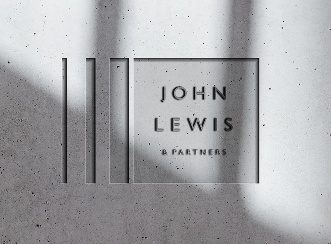
Pentagram's rebrand for John Lewis and Waitrose was rolled out this week and as I used to work for John Lewis and like branding/design, it is something that really intrigued me. Pentagram is the world's largest independent design consultancy firm based in London, New York and Berlin. It is run and owned by 21 designers, who are all specialists in their own field. Harry Peace is the designer who undertook the JL project, which took three years to develop, due to the sheer size of the rebrand. Pearce was interviewed by It's Nice That. He said that his new designs are 'complex, sensitive and authentic, it's the result of three years of detailed design thinking'. 'It's just got such an amazing history of design integrity' Pearce says, 'brands with integrity is a really attractive thing'. I really like this combination of text/photography, the use of bold and distinctive colours is really effective in my opinion. However, I would have liked it if they'd continued to use vibrant colours like this in the rest of the rebrand. Pearce spoke about the importance of using Gill Sans for the partnership, 'we've used inspiration from the past', 'Gill Sans is kind of British, isn't it?', 'It just seemed so natural and why change a good thing?' The rebrand included a new logo, advert (by Dougal Wilson), signage, uniforms and lorries. It was 18 years ago that the John Lewis Partnership (JLP) was last branded, a lot has changed in this time including the way retail works, social media and design. The unique thing about JLP is that it is owned by all of its employees, this is why it calls it's self a Partnership. Each staff member is called a 'Partner' and they all receive part of the profit in the form of a yearly bonus. This is something that Pearce wanted to highlight in the new branding, is the whole philosophy of the company and how it functions as a business with it's partners. This is evident from the slogan at the end of the new advert which reads 'when you're part of it, you put your heart into it'. Pearce says 'the philosophy of the company has been written into the logo', it now reads John Lewis & Partners rather than John Lewis. The new striped logo stems from Peter Hatch's design for JLP in the 1960's as seen below then Harry Pearce's new design below that. Personally, I feel that the new branding seems very plain. Pentagram is such an influential design agency, I'd hoped that they would have produced something a bit more exciting rather than using simple stripes in black and green, especially as they spent three years working on this. Even though these are the brand colours, I feel that it they could have been more creative with the project.
The new John Lewis advert www.youtube.com/watch?v=hOmZXG19Ets Quotes from www.itsnicethat.com/features/pentagram-harry-pearce-the-john-lewis-partnership-redesign-graphic-design-050918 Photos from www.pentagram.com/work/the-john-lewis-partnership www.eyemagazine.com/blog/post/type-tuesday38 For more inforation visit www.pentagram.com/ www.pentagram.com/about/harry-pearce www.johnlewis.com/ |
About me
I am a Graphic Designer and graduate from Nottingham Trent University. This blog is to document my work, inspiration and general things that interest me. Archives
February 2021
|
