|
1. Sheese Sheese is a dairy-free cheese brand from Bute Islands food, that is full of personality. Recently redesigned by The Space Creative, it is their first major rebrand in over thirty years. The new look has given the brand an identity that is bursting with character. The rustic and detailed illustrations really make the packaging stand out from most ordinary cheese brands and the overall rustic look paired with a punchy colour palette is enough to get anyone saying "Sheeeeese'. 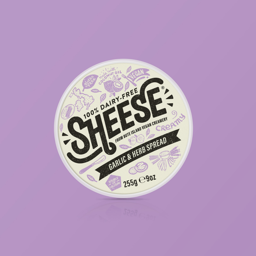 2. Petty Wells Petty Wells a French pet food brand with a unique and playful twist. The brand offers a tailor made menu best suited to your pet's needs. The branding features playful illustrations and a bright colour palette to really show off the adorable little dog illustrations. After answering a few questions online, the meals arrive conveniently and directly to your door on a monthly subscription basis. And the best part is - it's all natural food! 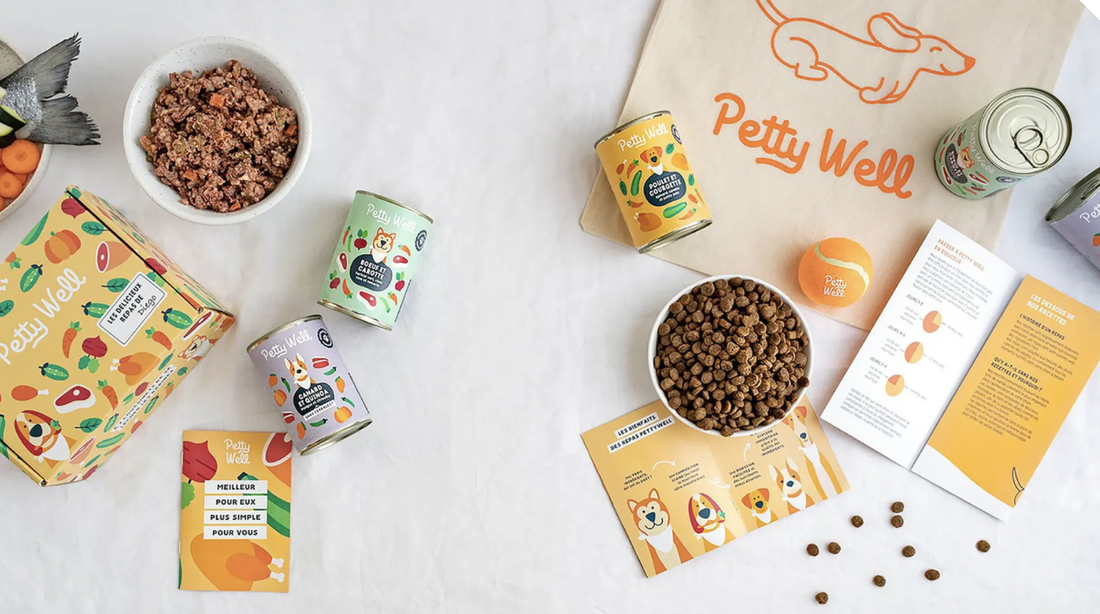 3. Jeni's Jeni's Ice Cream is an artisanal ice cream brand originating from Columbus, Ohio in the US. Jeni's is an example of branding identity that I have admired for months now. The identity is dynamic, so much so that each packaging features different colours and patterns yet the brands still remains recognisable. The bold and colourful palette allows the packaging to stand out against other ice cream brands. Lettering artist Jessica Hische is to thank for the beautifully crafted letters. 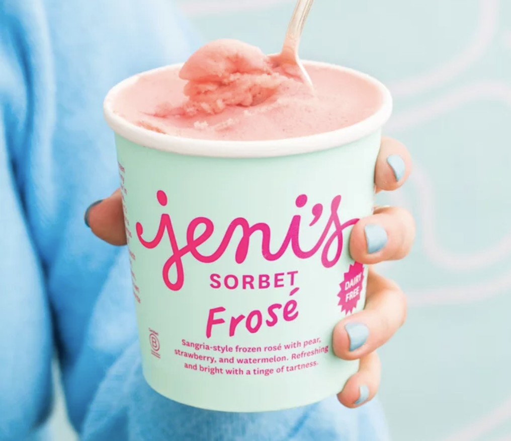 4. Mamamade Mamamade is a plant-based baby food delivery service. Desinged by Childish Design, the branding identity celebrates the sense of a community between parents, who are all doing their best to give their children the best chance in life. The type choice and deep purple seems very mature at first for a children's food brand, yet the brighter colours bring the childlike and more playful qualities into the brand. I think it is a dynamic way to reinvent and bring beautifully crafted branding identity to children's food branding. 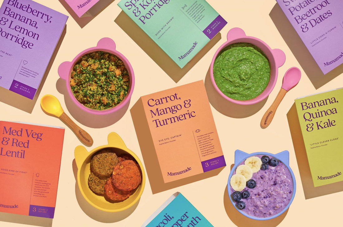 Images and information from 'The Dieline' and 'Creative Boom' links below:
Petty Well https://thedieline.com/blog/2021/1/29/adorable-illustrations-dominate-petty-wells-pet-food-packaging? Sheese https://thedieline.com/blog/2021/2/9/sheese-vegan-cheese-didnt-have-to-be-that-good? Jeni's https://thedieline.com/blog/2017/11/14/i-scream-you-scream-we-all-scream-for-jenis-splendid-ice-cream-and-their-new-packaging? Mamamade https://www.creativeboom.com/inspiration/childish-design/
0 Comments
Leave a Reply. |
About me
I am a Graphic Designer and graduate from Nottingham Trent University. This blog is to document my work, inspiration and general things that interest me. Archives
February 2021
|
