|
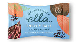
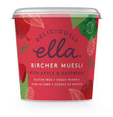
Recently I've been working on a packaging design project about bird seed. It has encouraged me to look at all different types of packaging, here are some that I have been loving. Deliciously Ella. I love the bright and vibrant colour schemes to this packaging and the illustrations around the edges of the ingredients that are inside is a beautiful detail. 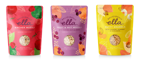
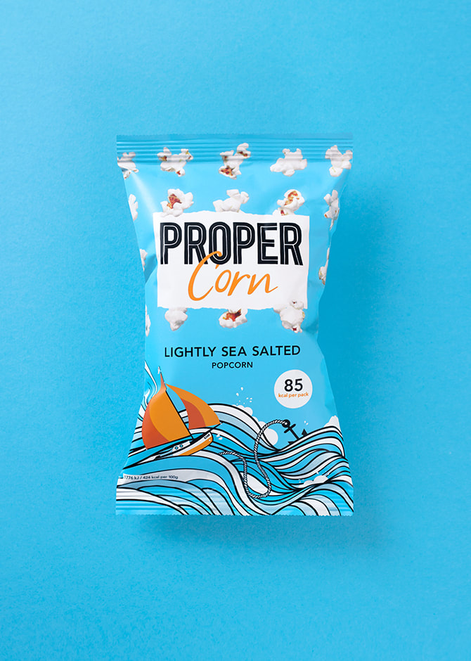
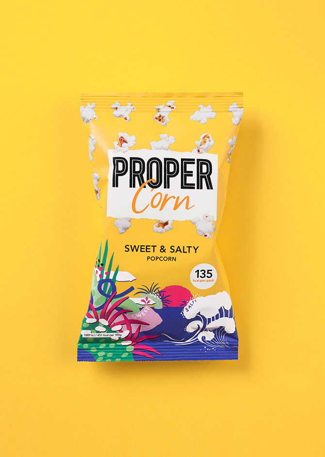
Propercorn. A sweet and vibrant range of popcorn, I really like the use of illustration on these packs. 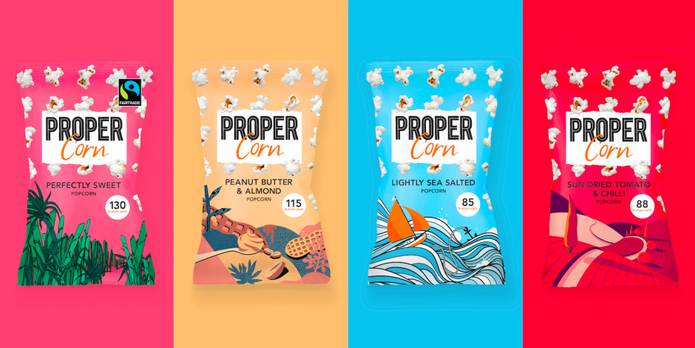
Innocent smoothies. Innocent smoothies have always taken extra care in their packaging and even add jokes to the little details of the pack. It's really clever how they bring humour and social awareness to the brand. For example below is a photo with knitted hats on each of the bottles. From this range, for every one bought, 25p is donated to Age Uk and so far they have almost donated £2.5 million pounds. How amazing! 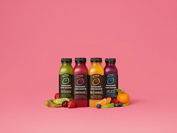  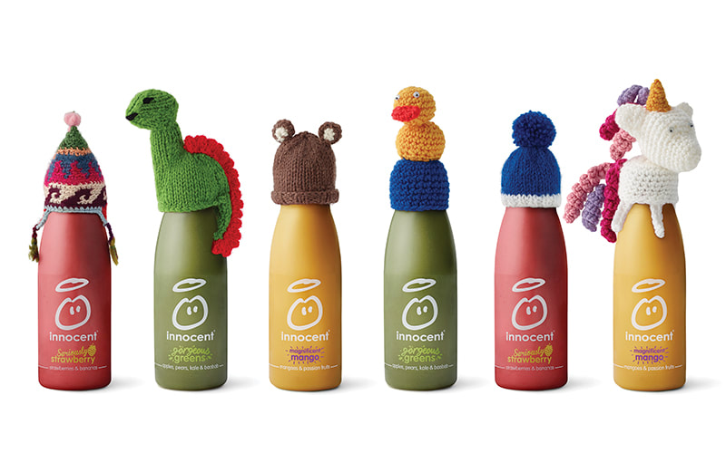 Graze. Graze is a healthy snack range that you subscribe to and it is delivered to your home, hence the shape and size of the box. Through the use of colour and illustrations they've made it a fun and exciting product. 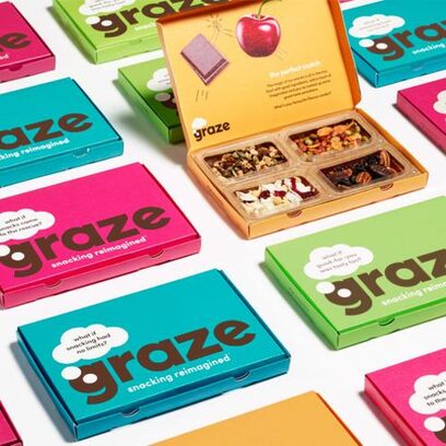 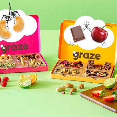 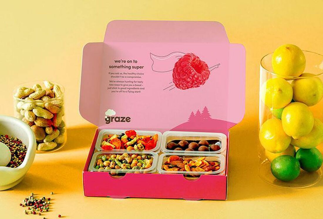 Birds & bees. Birds & bees is a beautifully designed bird seed range I came across while researching for my project. I like how the colour schemes work both, individually and together. The illustration shapes work so well and I like how the label is made to look like a little sign, a simple trick but fits with the design so well. 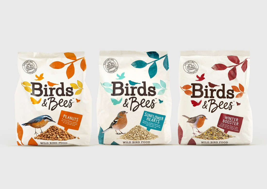 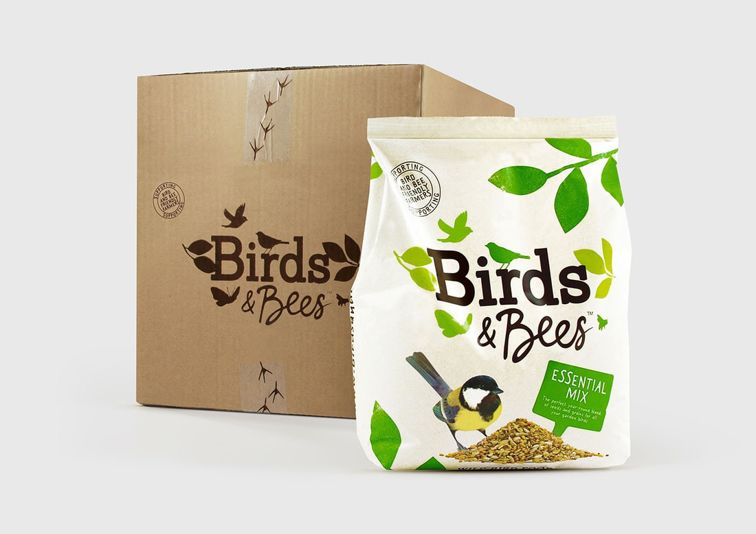 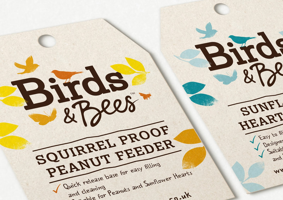 Wagg. Wagg is another brand that I came across while researching, I love the colours again, they're so vibrant and give the whole brand a very playful feel, which really suits a pet food range. 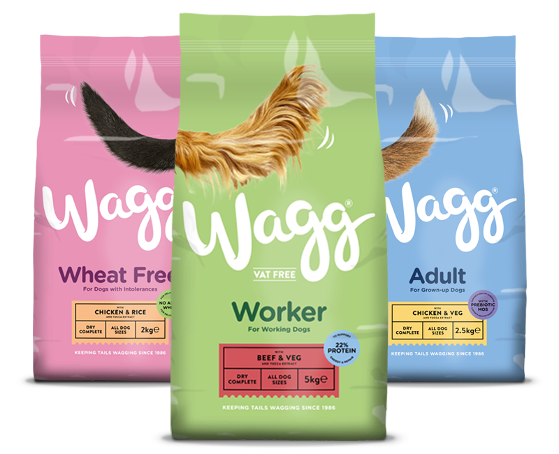 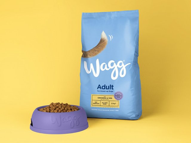 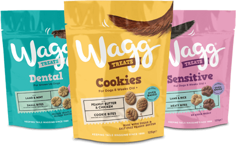 Papergang. Papergang is a delivery focused stationary service. Its colourful, fun and each edition is designed differently. 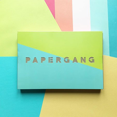 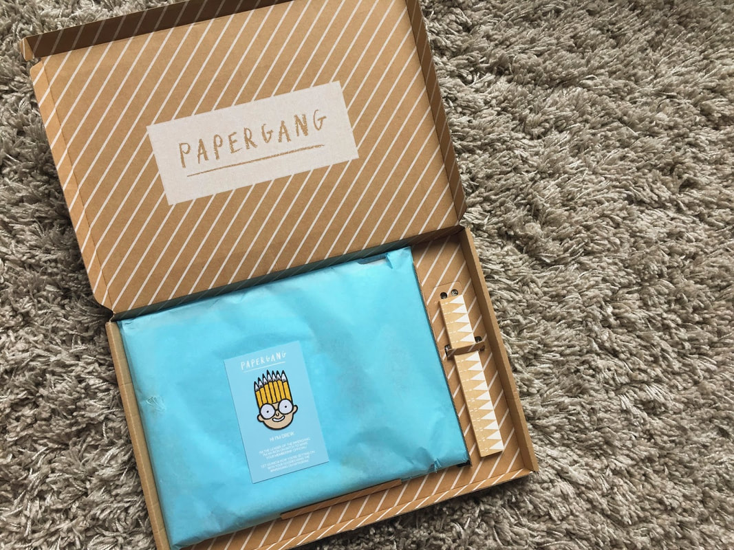 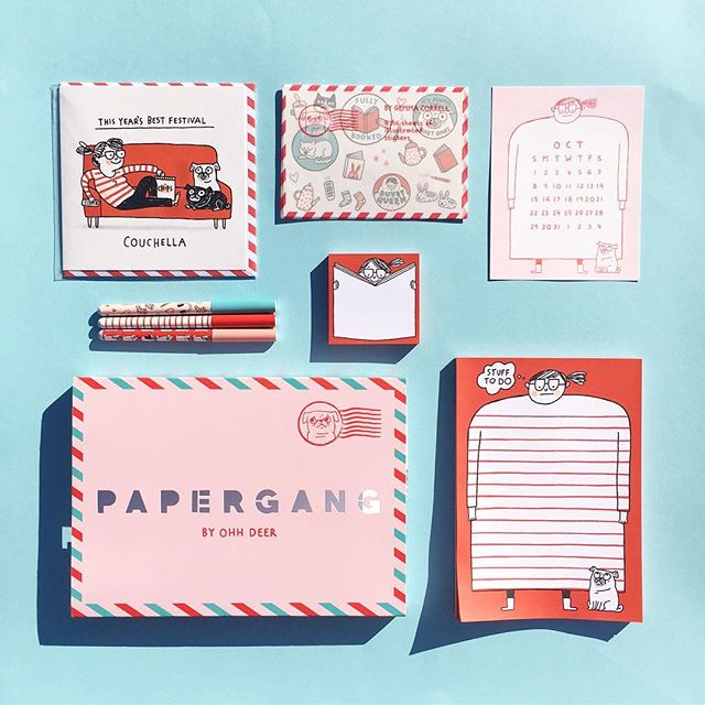
0 Comments
International Women's Day is celebrated on the 8th March every year. It began when the Socialist Party of America organised a Women's Day on 28th February 1909 in New York. The 8th March was chosen because that is when women gained suffrage in Soviet Russia in 1917 and it became a national holiday there. 58 years later, the United Nations began celebrating International Women's Day. In some countries it is celebrated as a public holiday and the celebration of womanhood, whereas in others it is utilised as a day of protest. 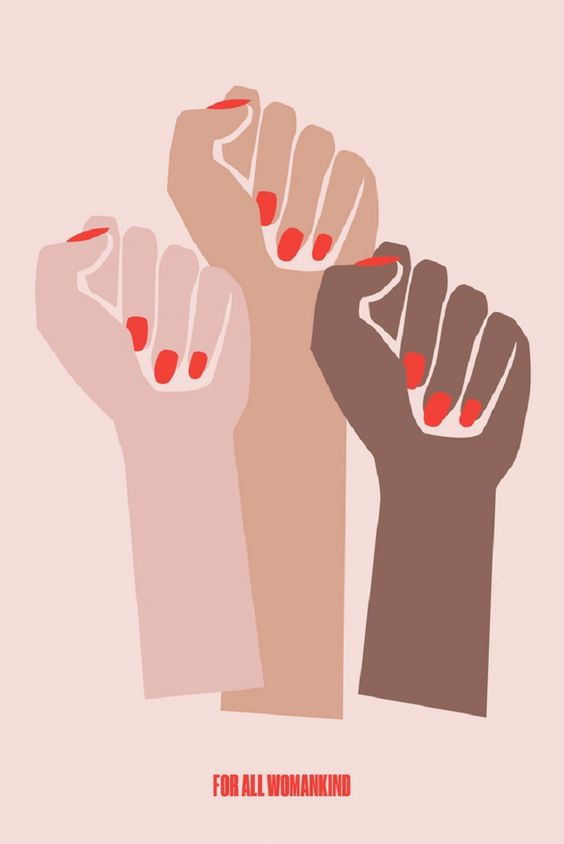 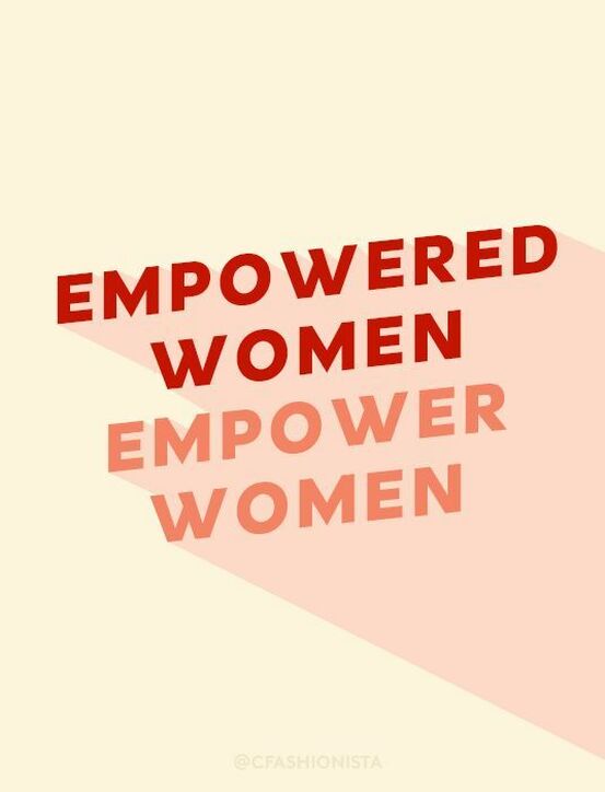 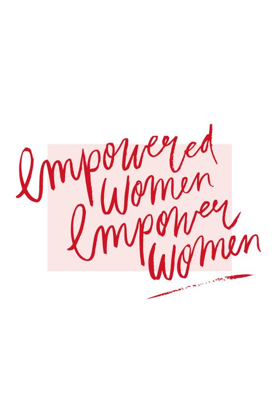 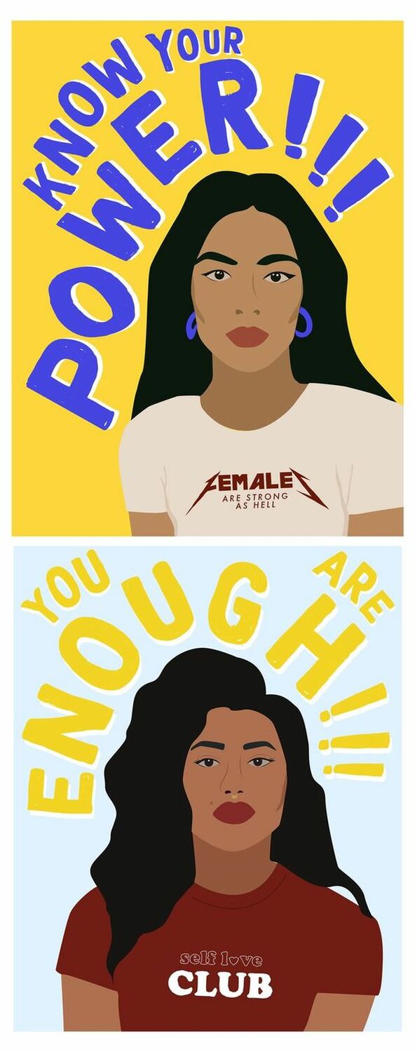 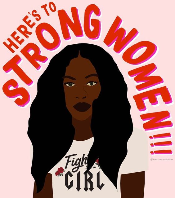    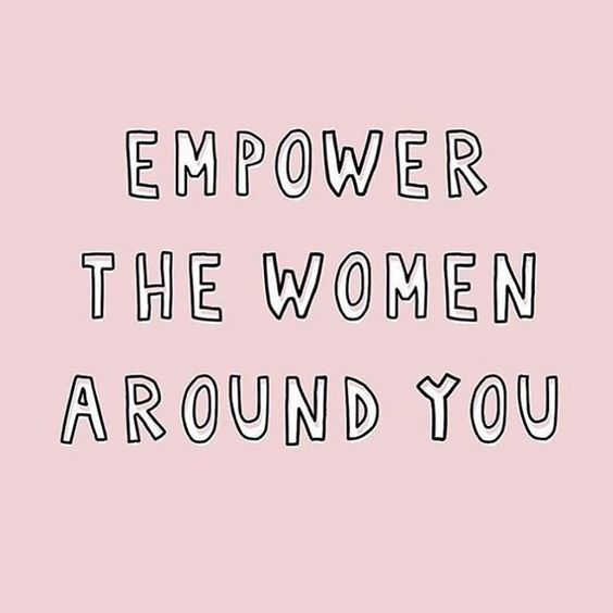 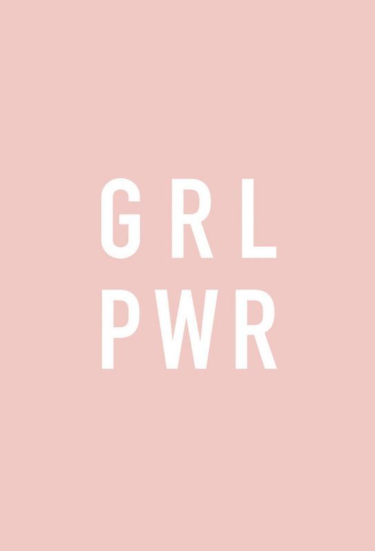 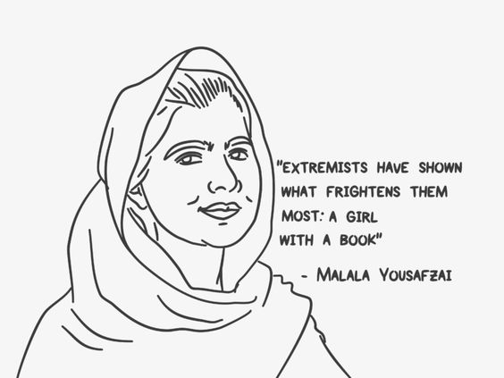 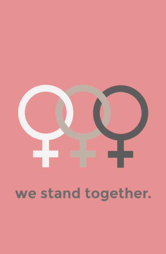 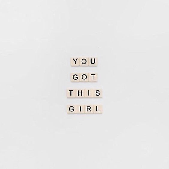 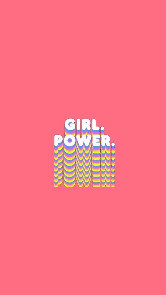 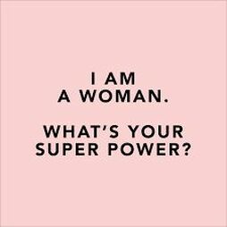 Images from Pintrest
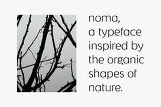
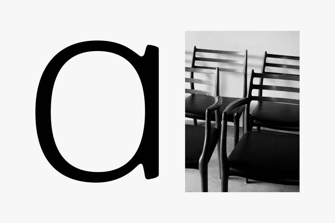
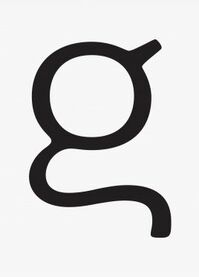
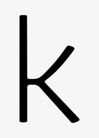
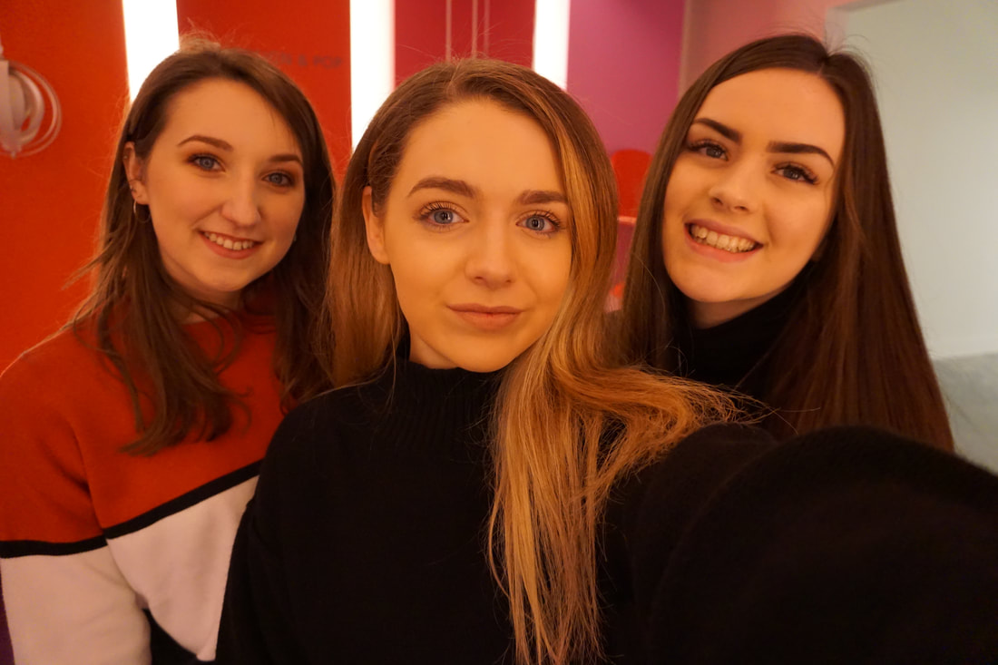
While in Copenhagen we had the amazing opportunity to visit 3 design agencies, speak to them and see the environment that they work in.  Kontrapunkt Kontrapunkt is a very established design agency, set up and run by the influential designer Bo Linnemann. 'Our story starts in Copenhagen more than 30 years ago. If you visit our office in the heart of the city centre, chances are that you will see a lot of our work in the streets, banks, museums, pharmacies - even the parliament - on the way.' Words from their website. This is what we found after visiting Kontrapunkt, every corner you turn in Copenhagen you will see something designed by Kontrapunkt. We were given a presentation by the founder of the company, Bo Linnemann. He has influenced Danish and international design since the early 1980s and was awarded the Danish Design Award 17 times. He has also recieved numerous design awards. While Bo was speaking he explained that he had designed for many world famous brands. He actually designed the logos for none other than Lego and Carlsberg, world famous brands and logos seen my thousands of people round the world. Apotek Bo designed this for the Danish pharmacies who all have this sign outside. He said that it was based on a Bauhaus sketch of an unpublished font that had a rounded outside and a square inside for the counters. Once he spoke about this piece he designed, we saw it on every corner in Copenhagen and even in the Design Museum. 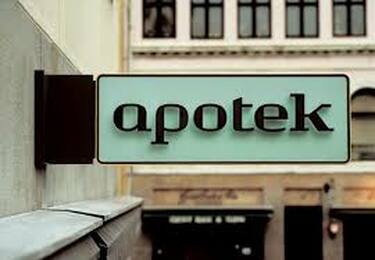 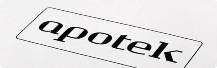 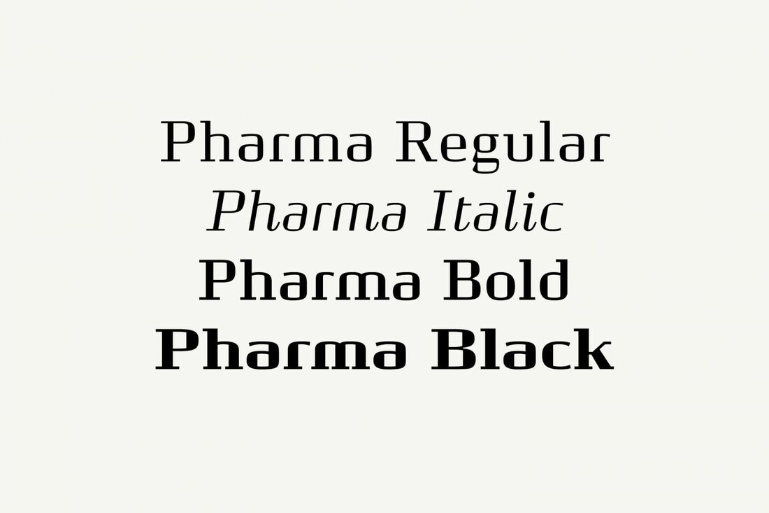 Noma Noma is an infamous restaurant in Copenhagen. Bo designed this beautiful typeface based on the the shapes of nordic nature as seen below this is a slide he showed us in his presentation. Its very clear to see where the letterforms get their inspiration from the delicate shapes of the sticks seen in the image below. 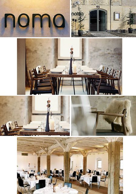
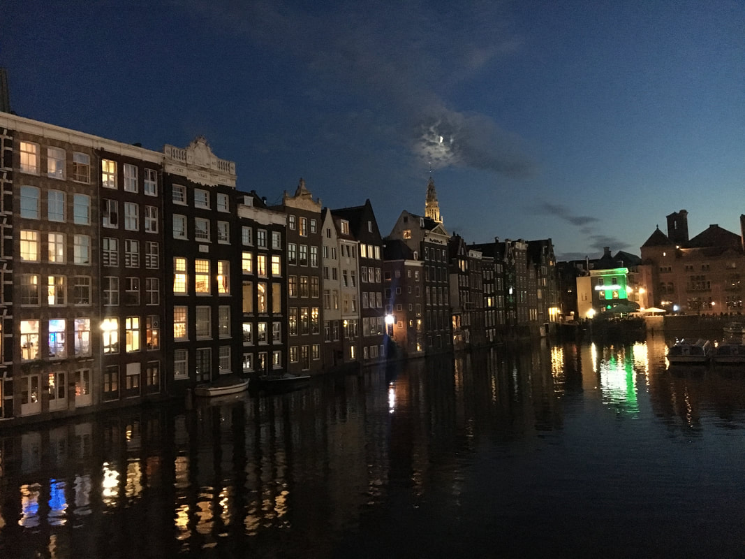
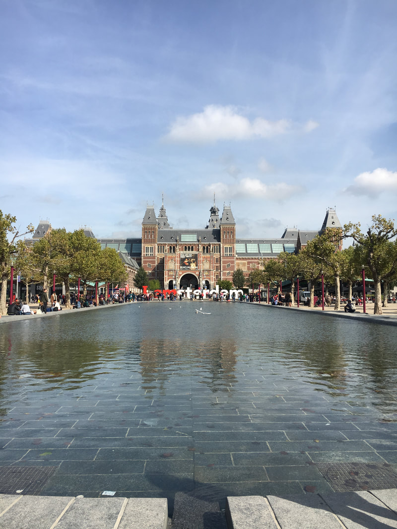
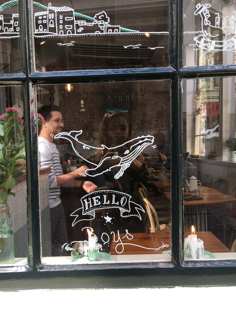
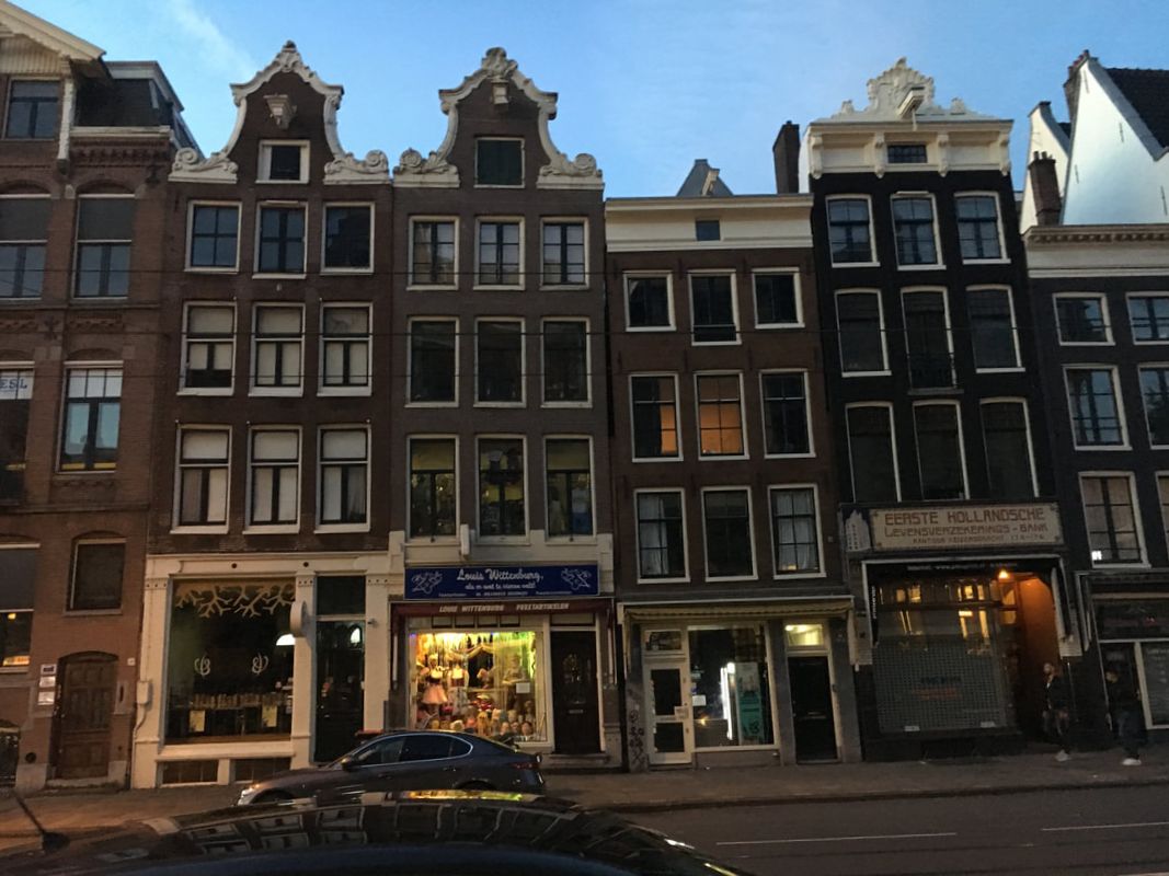
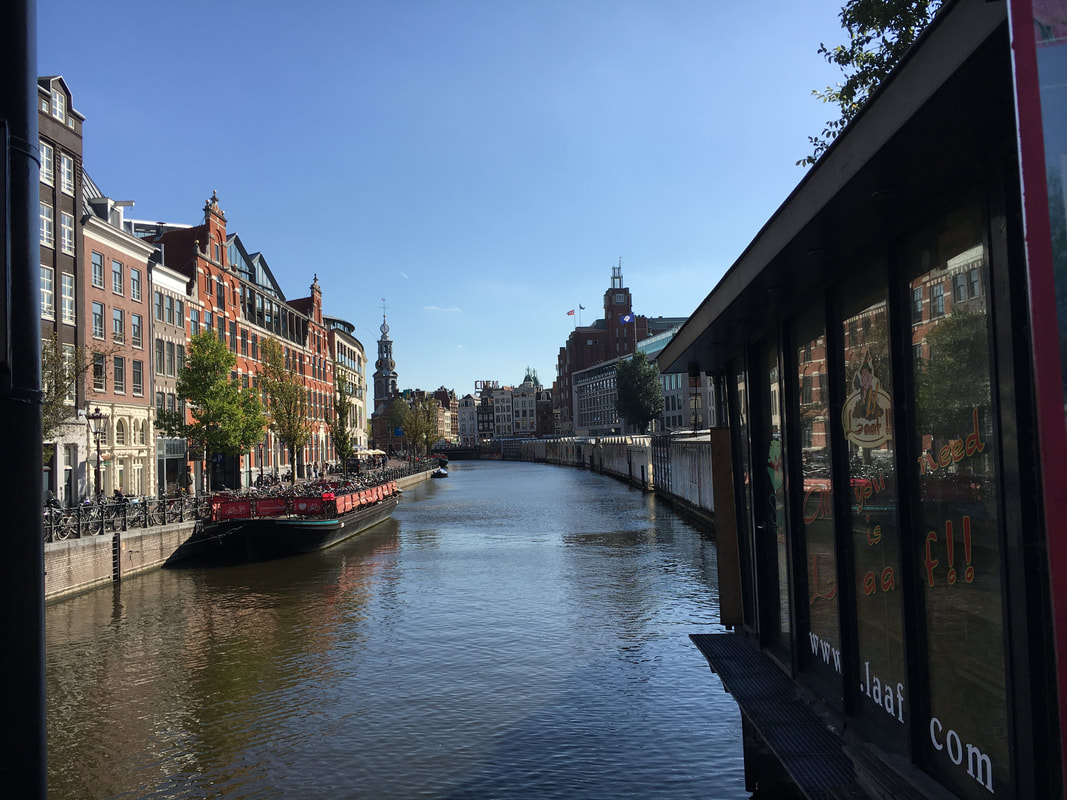
For more information go to https://www.kontrapunkt.com/ Nyhavn Canal Nyhavn (meaning New Harbour) is a 17th centure waterfront, canal and entertainment district in Copenhagen. It is lines with brightly coloured 17th century townhouses, bars, cafes and restauraunts and many historical wooden ships. 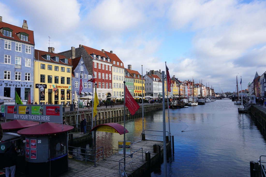 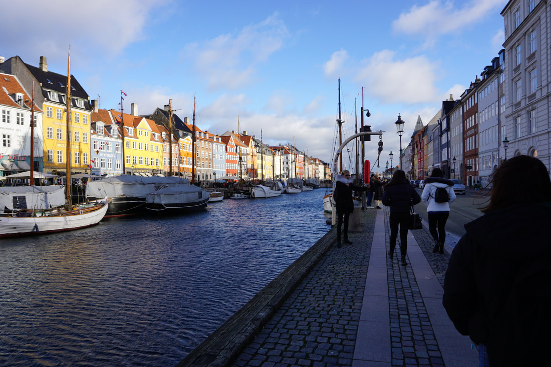   The Round Tower The Round Tower is a beautiful round tower from the 17th century. Originally belonging to the Christian IV of Denmark, who would exercise his horses by walking them up the tower. The way that the light comes in through the windows is really beautiful. It was built to be an astronomical observatory to see the expansive views over Copenhagen. 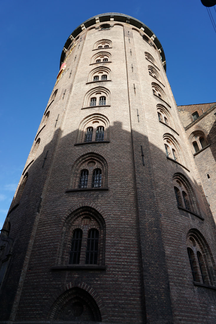 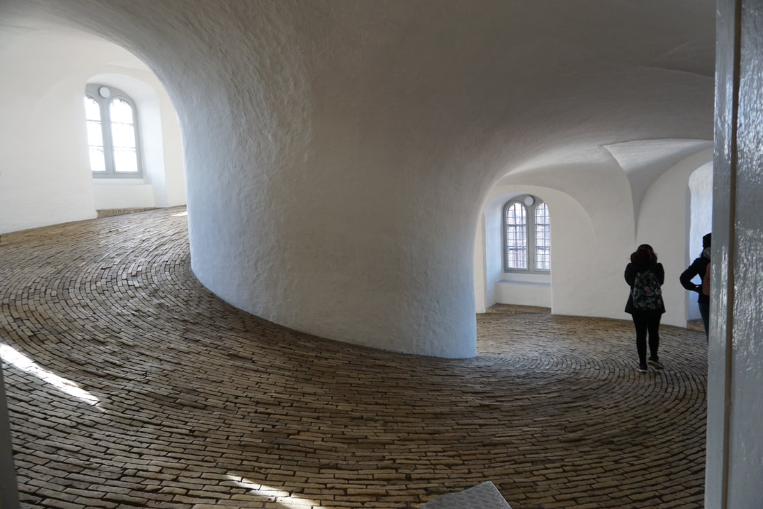 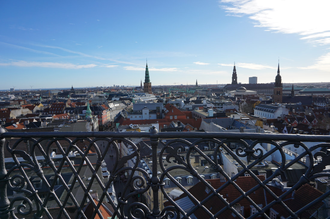 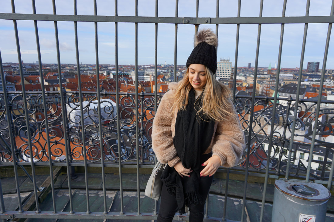 The King's Gardens The King's Garden is the oldest and most visited park in central Copenhagen. It was established in early 17th century to be private gardens for King Christian IV. The garden is home to the Royal Guards and the King's barracks. 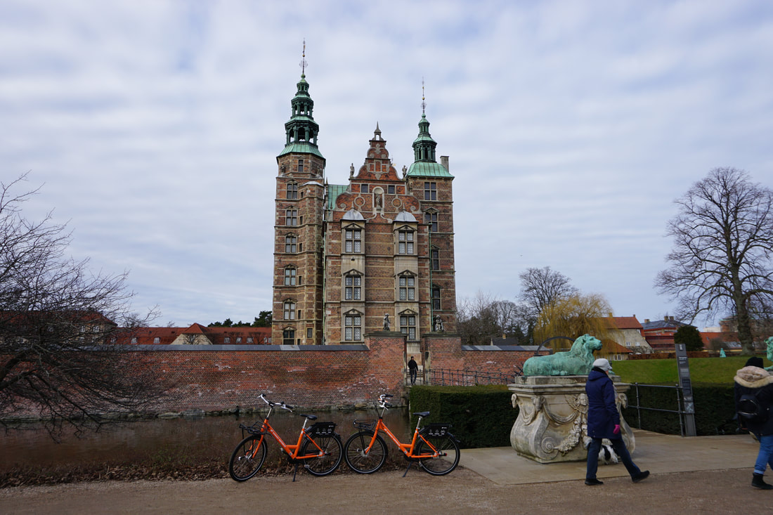 Tivoli Gardens Tivoli Gardens is an amusement park in Copenhagen. The park opened in 1943 and is the second oldest operating amusement park in the world. With 4.6 million visitors in 2017, Tivoli is the second most popular seasonal amusement park in the world after Europa Park. It is also the most visited theme park in Scandinavia. 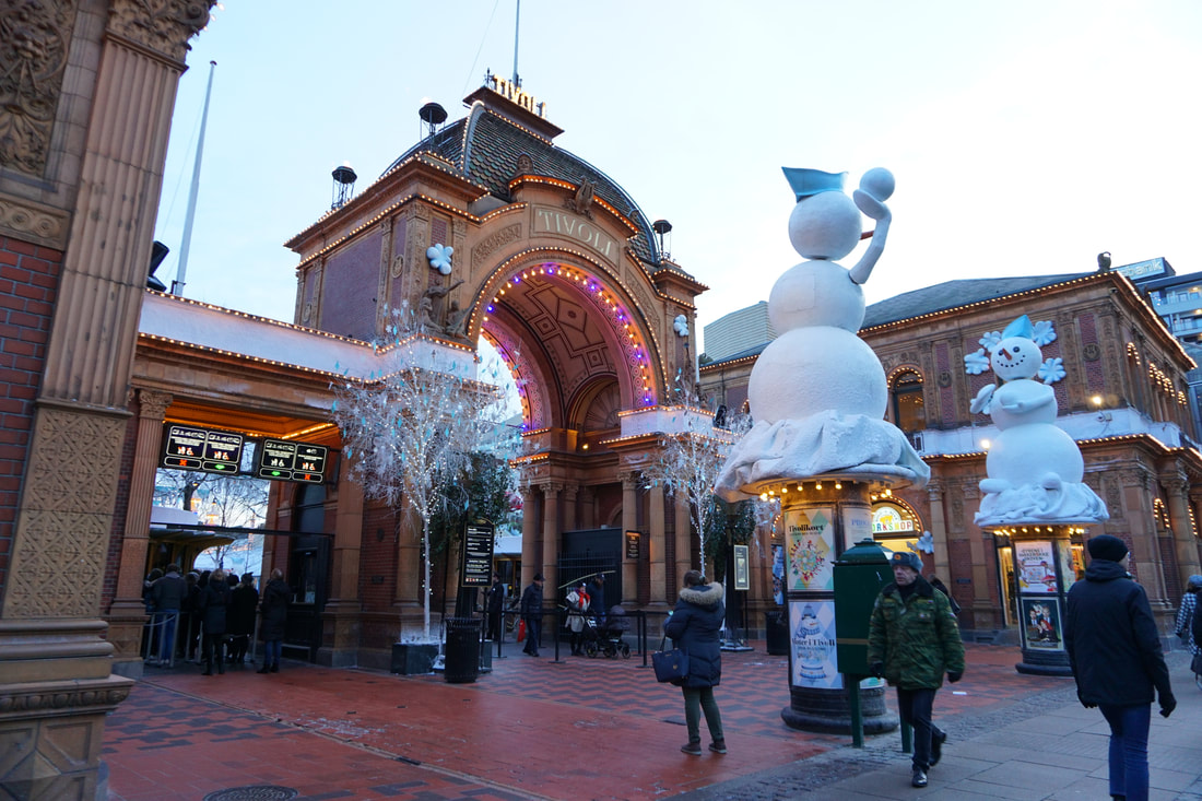 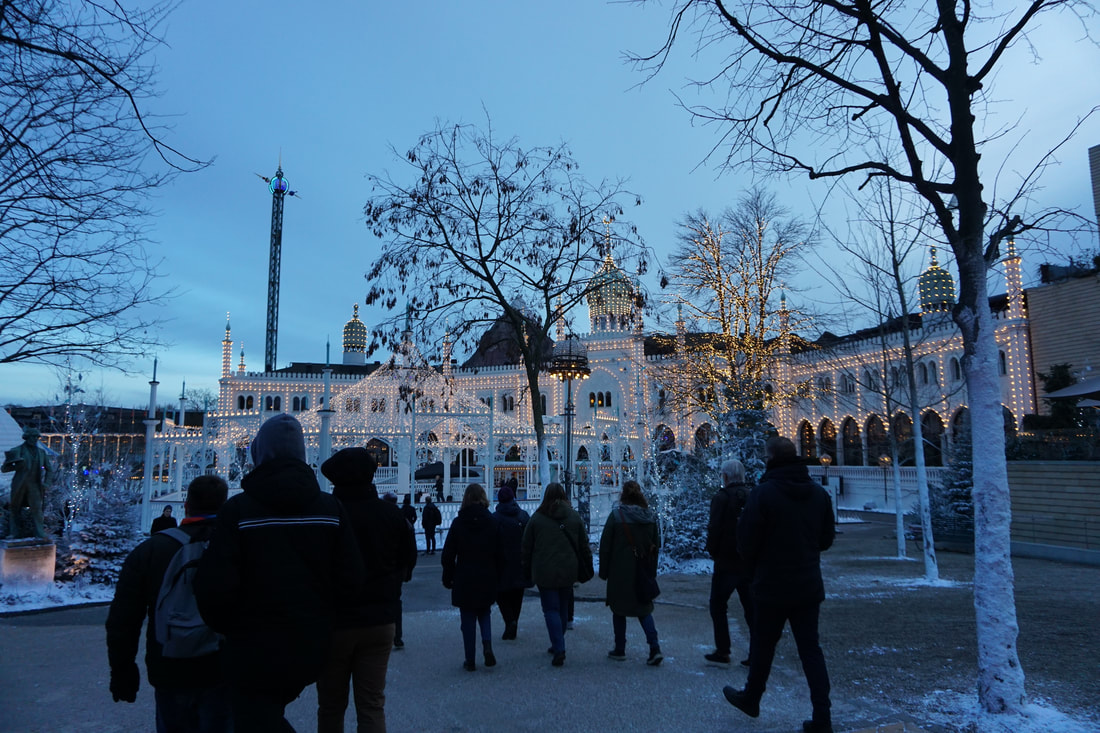 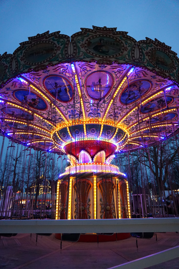 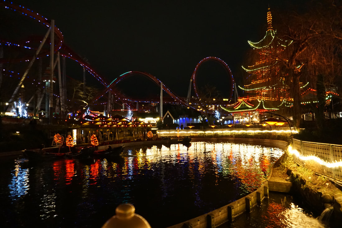 The Design Museum The Danish Museum of Art and Design feautures work from Danish designers such as Arne Jacobsen, Jacob Jensen and Kaare Klint. The building was originally a hospital built in 1752 and transformed into a museum in the 1920s. The museum houses the biggest library for design in Scandinavia.
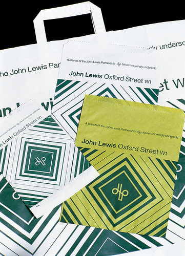
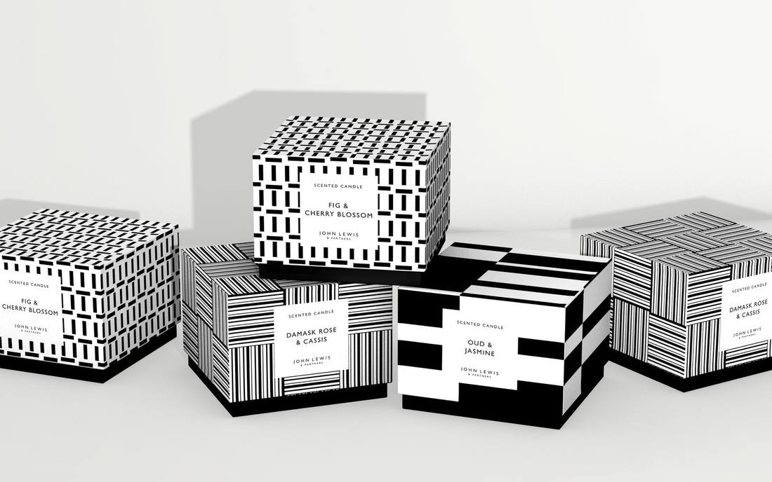
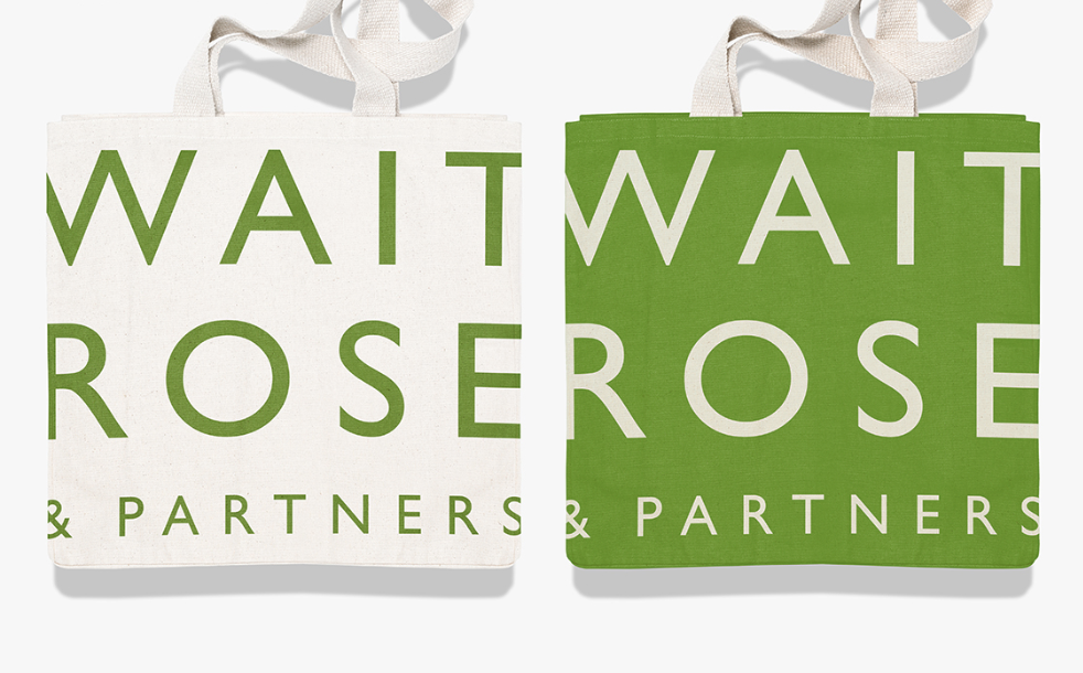
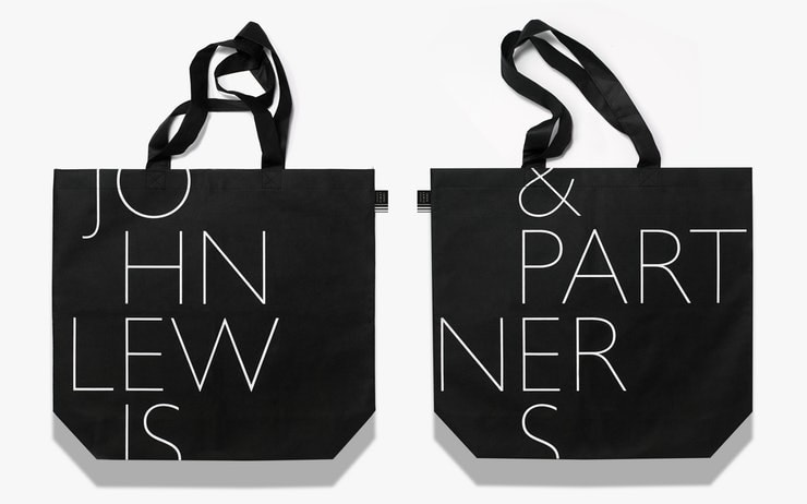
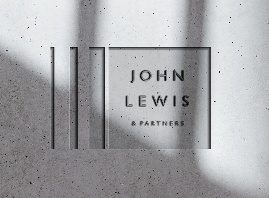
  The Little Mermaid The Little Mermaid is a bronze statue by Edvard Eriksen depicting a mermaid becoming human. The sculpture is placed on the top a rock by the water on a promenade next to the sea. The statue is based on the fairytale The Little Mermaid by the Danish author Hans Christian Andersen, the small and unimposing statue is now a iconic part of Copenhagen and is a major tourist attraction since being unveiled in 1913. 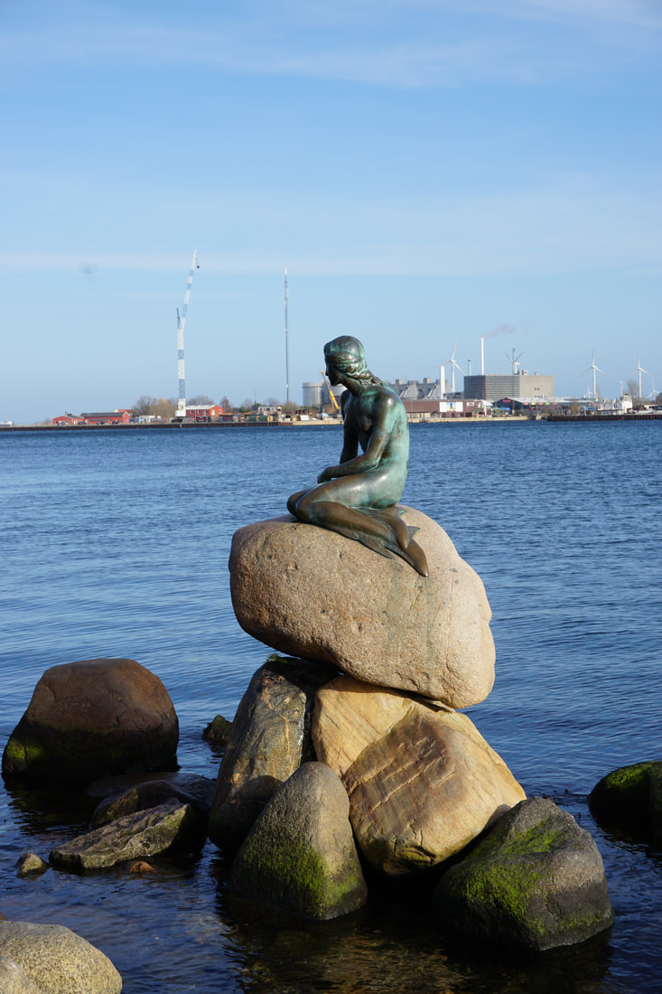 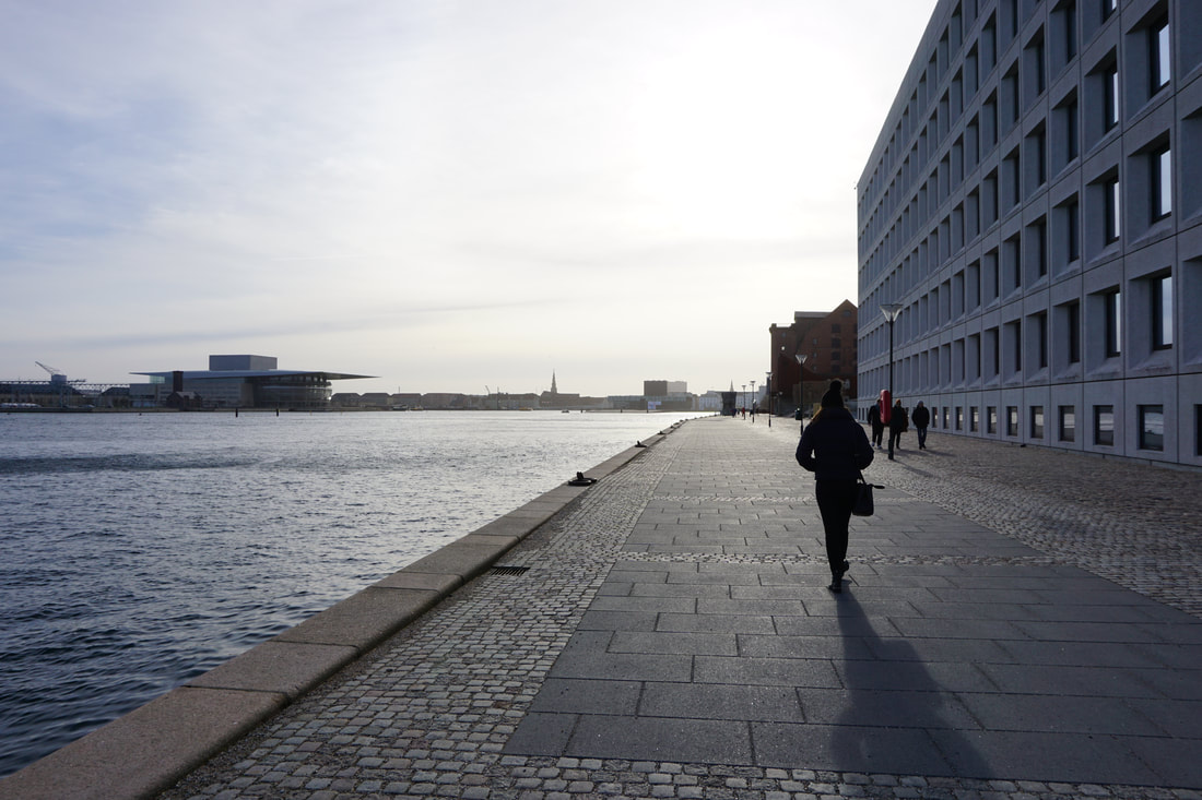  Nyhavn More of the beautiful, colourful houses of Nyhavn 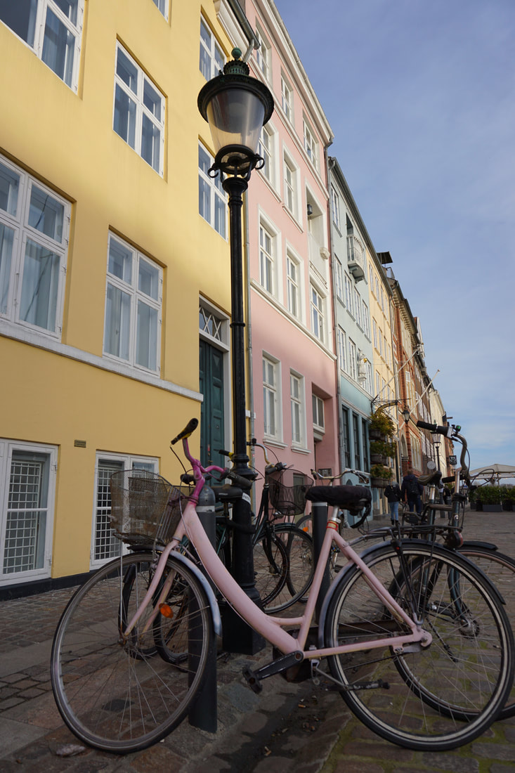 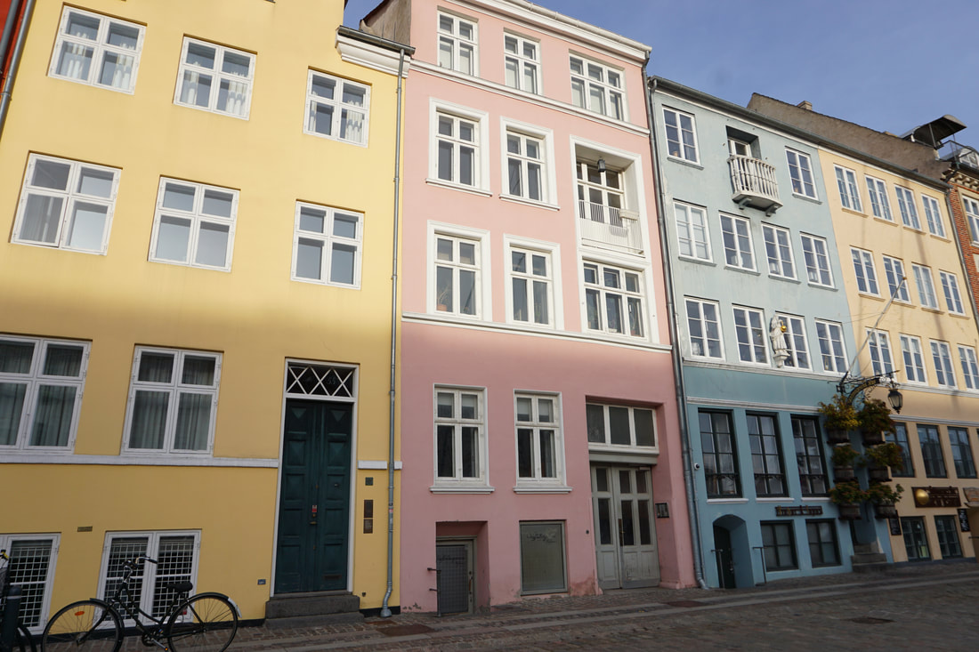 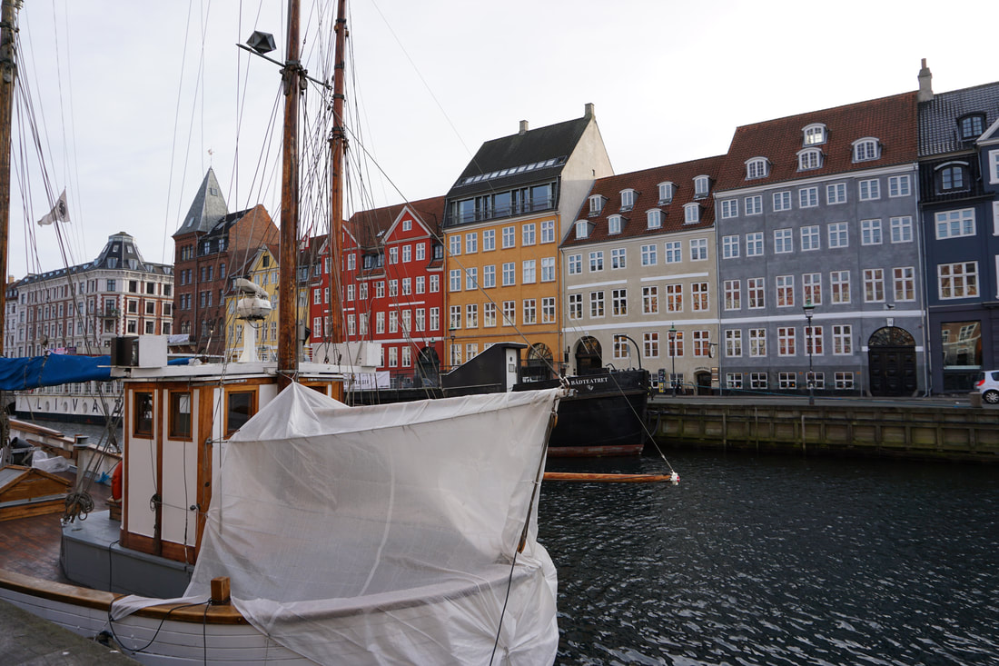 Alessandro D'Alcantara 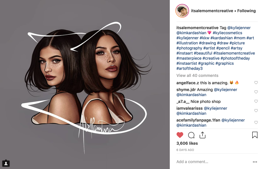 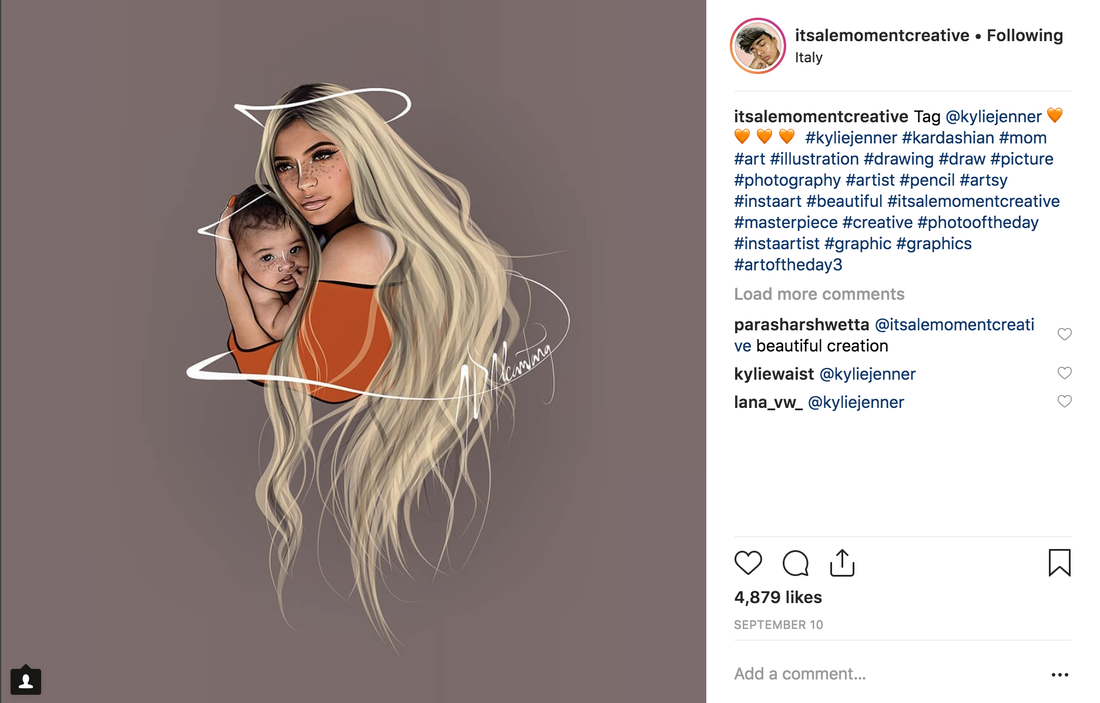 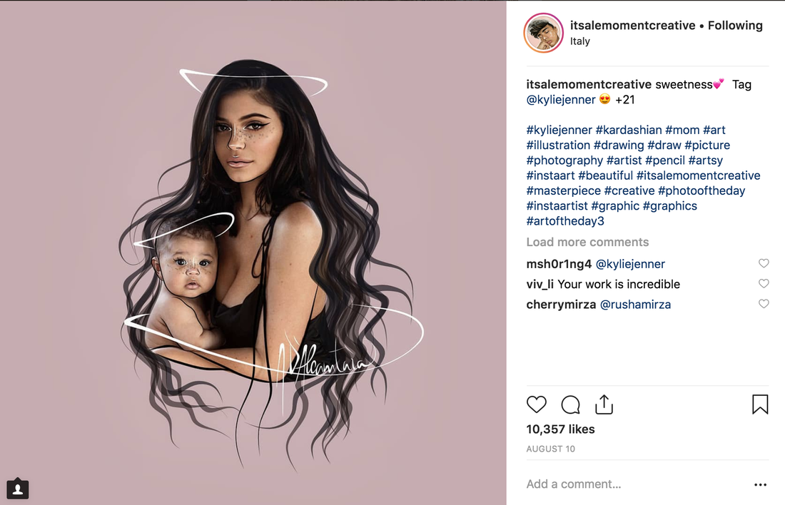 Abbey Lossing 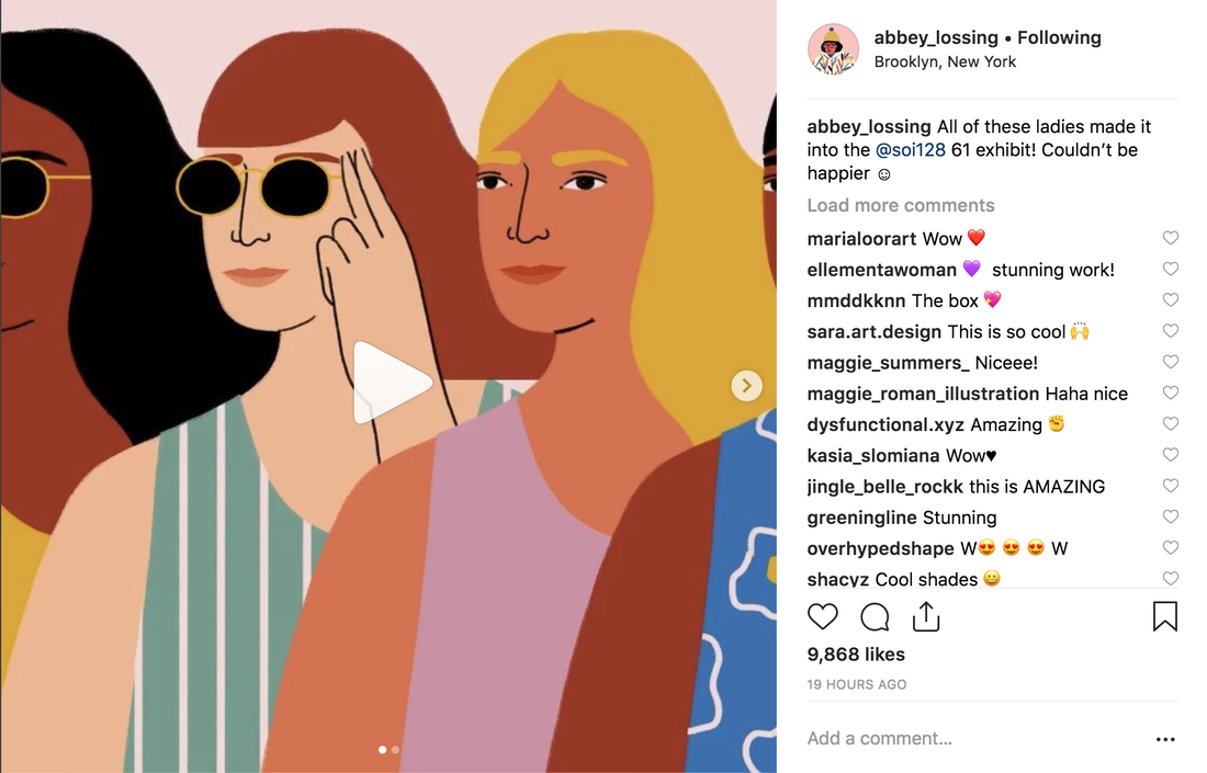 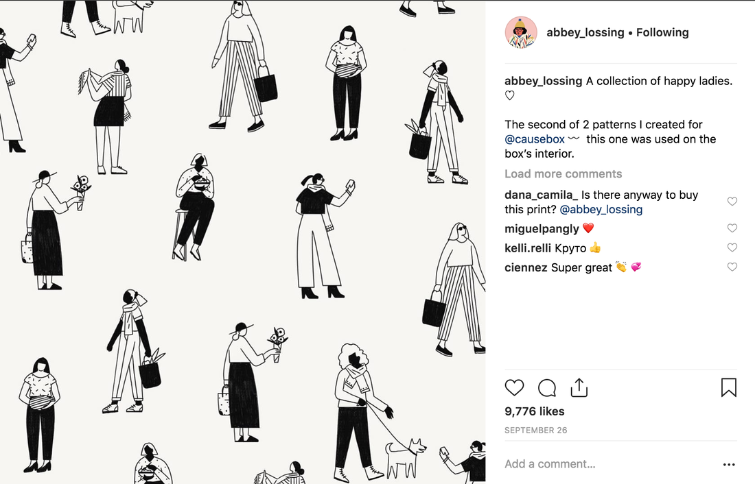 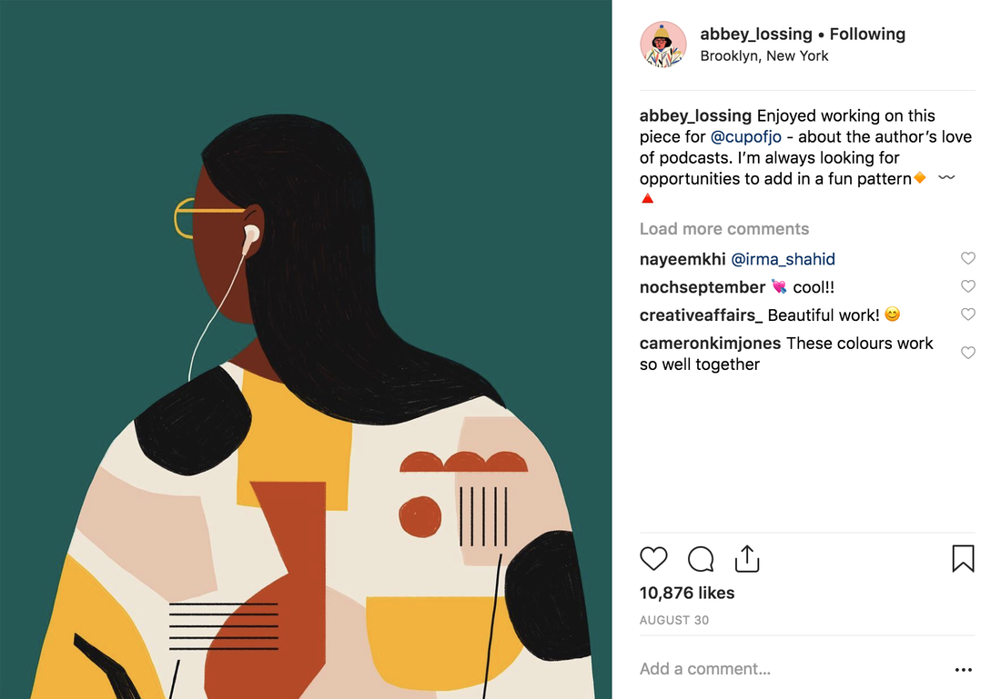 Gemma Correl 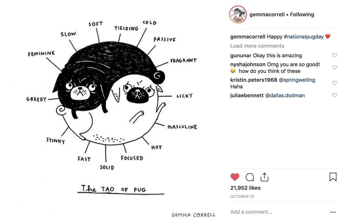 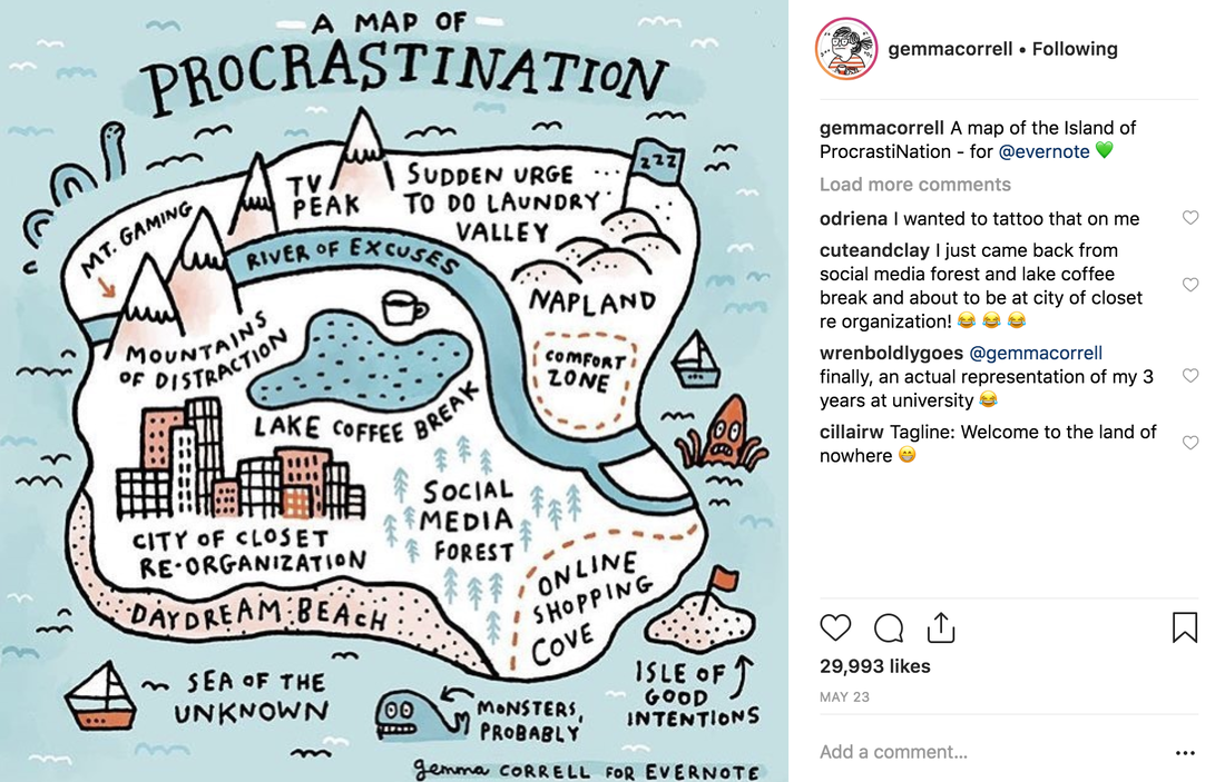 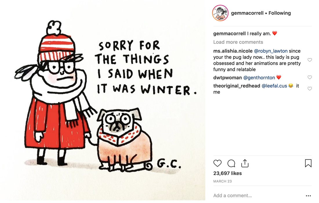 Emily Nash 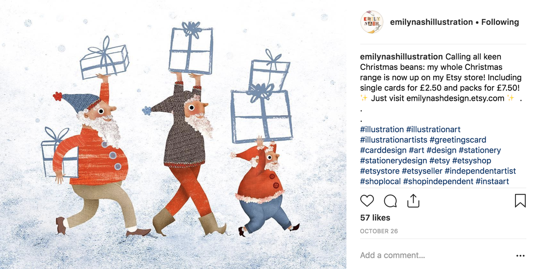 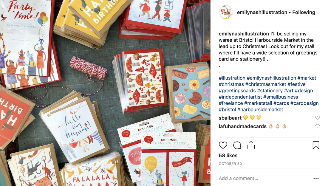 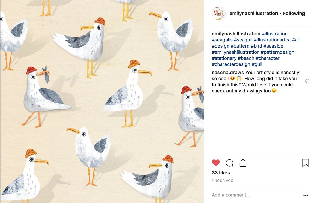 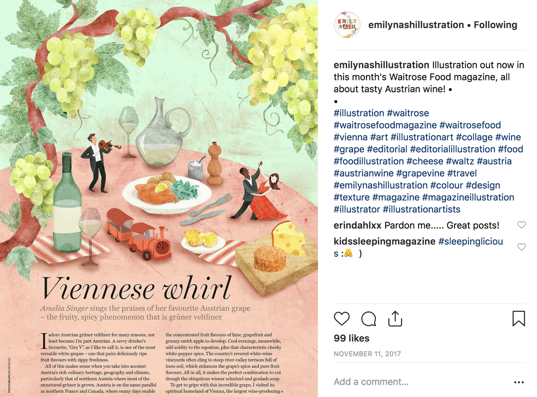 Emily Edwards 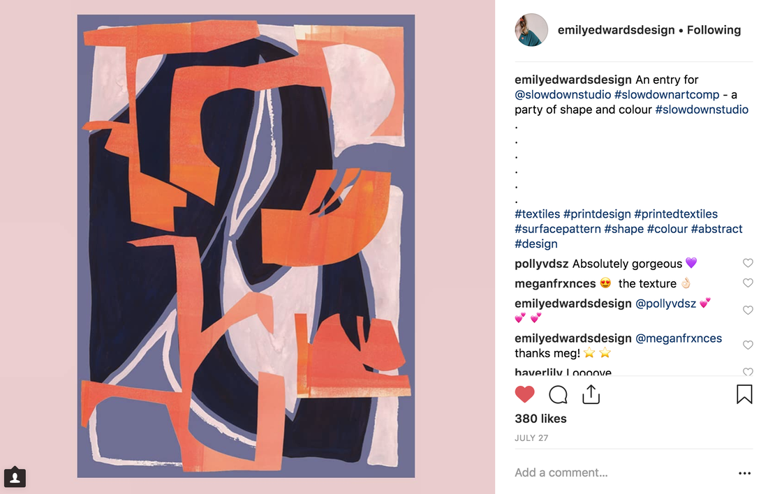      Time's Square 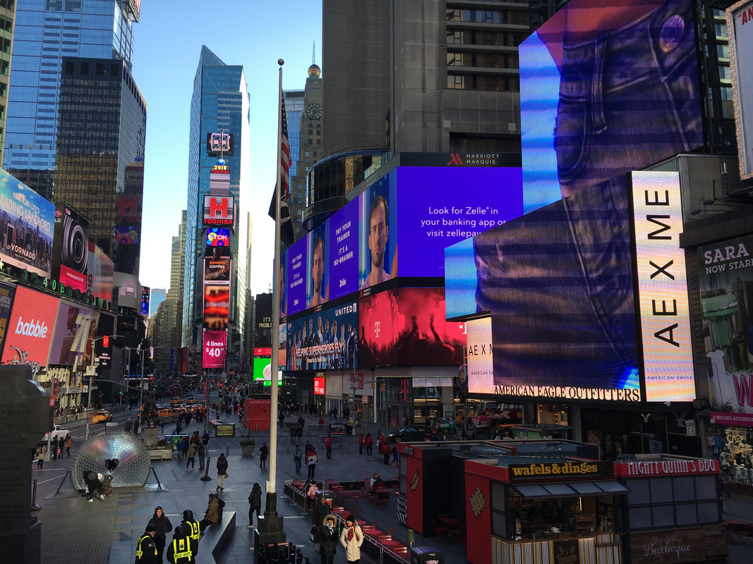 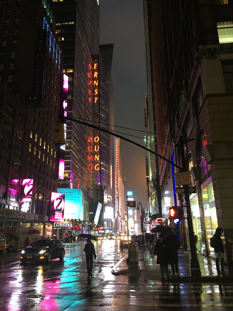 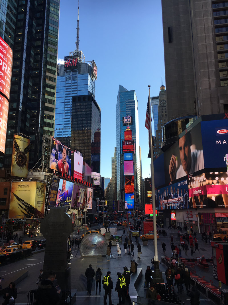 Top of the Rock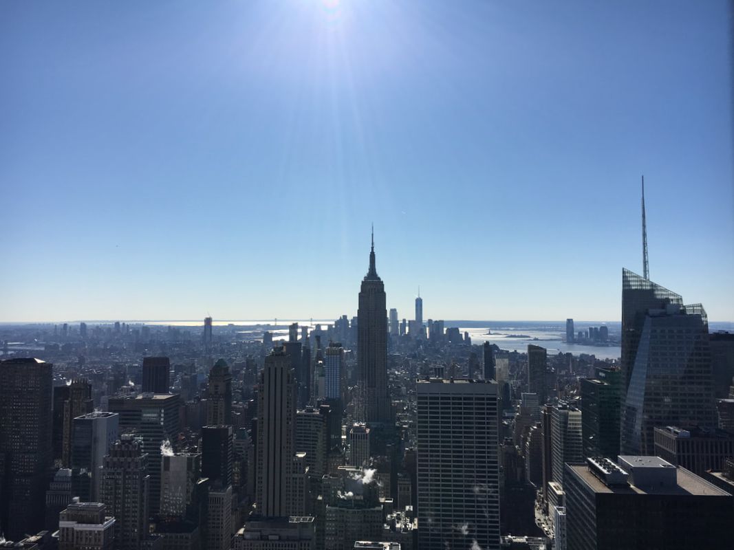  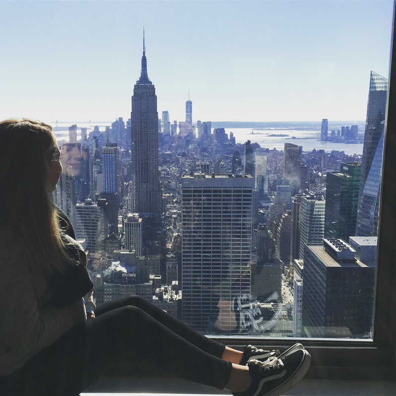 Empire State Building 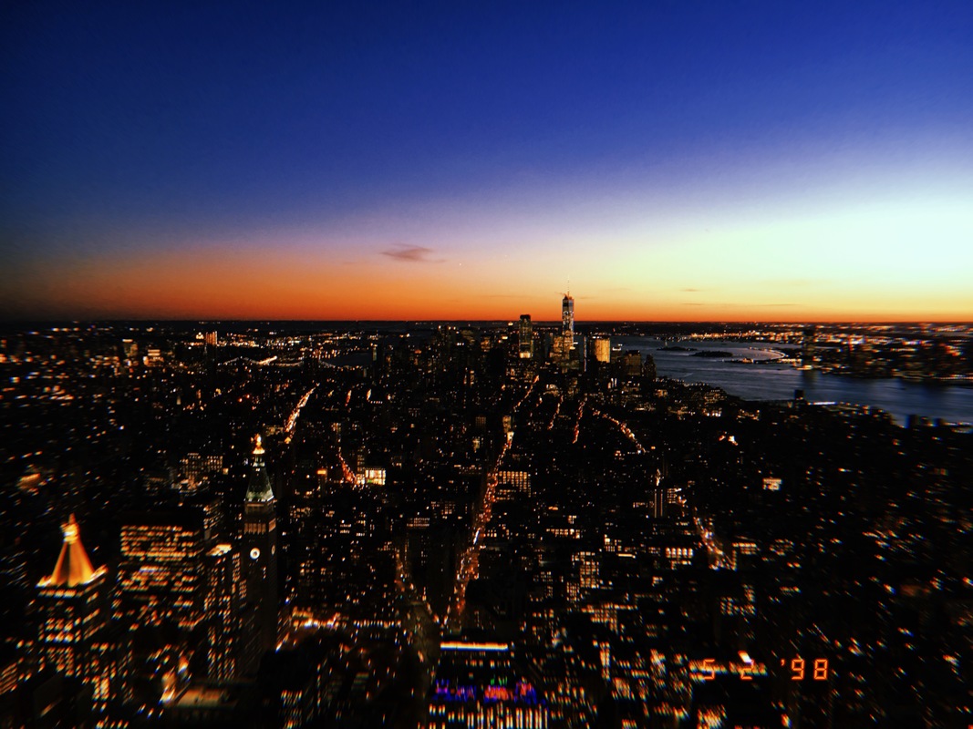 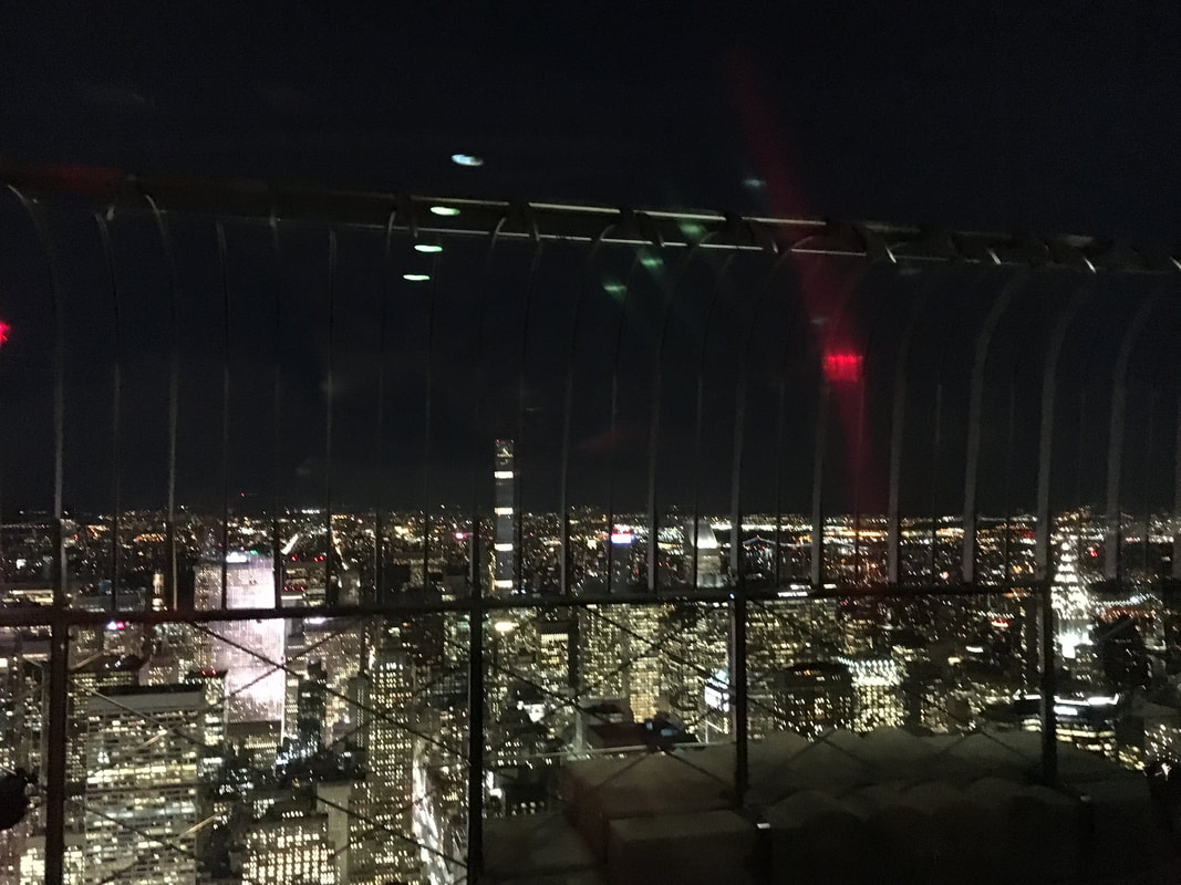 The Friends Apartment Building 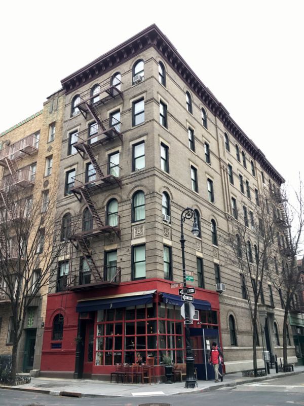 Chelsea Market 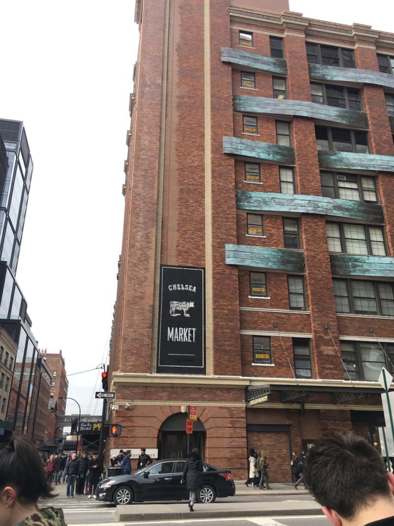 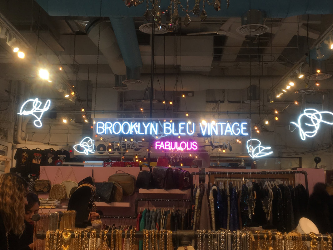 Citi Pups  Ground Zero 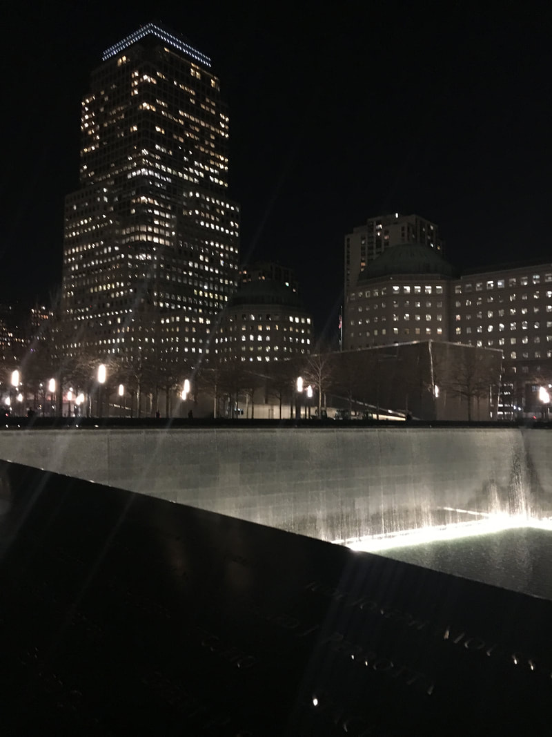 The 911 War Memorial 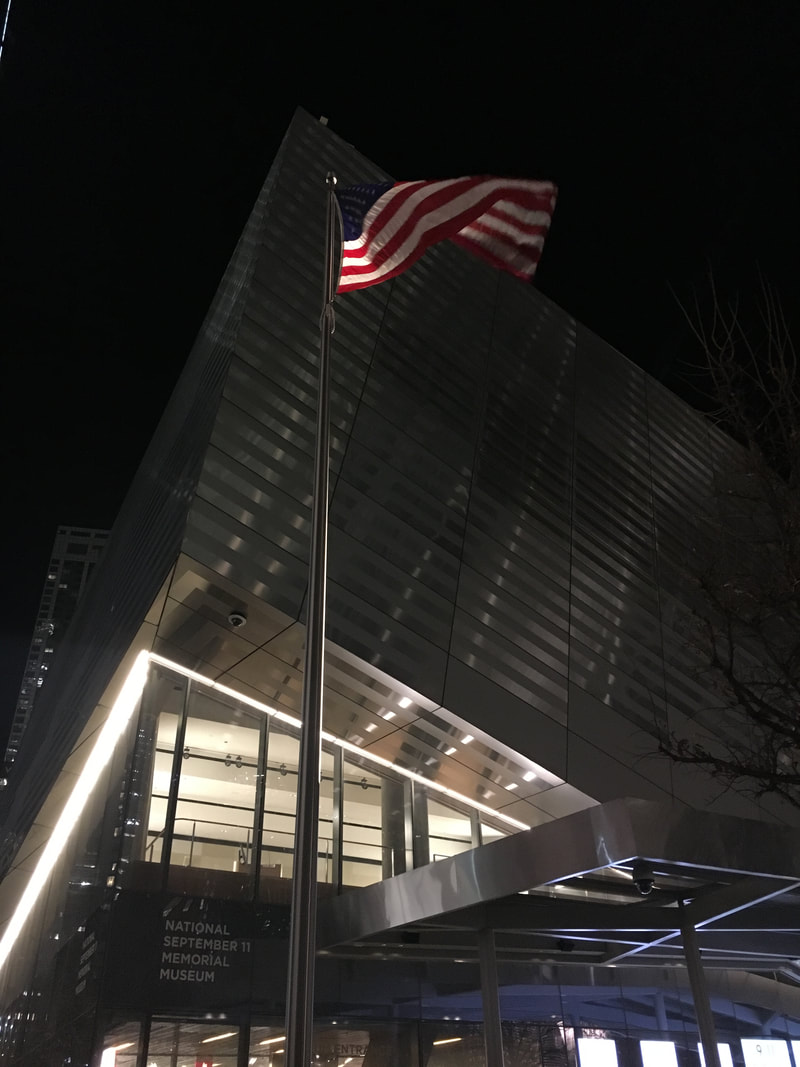 The Museum of Modern Art 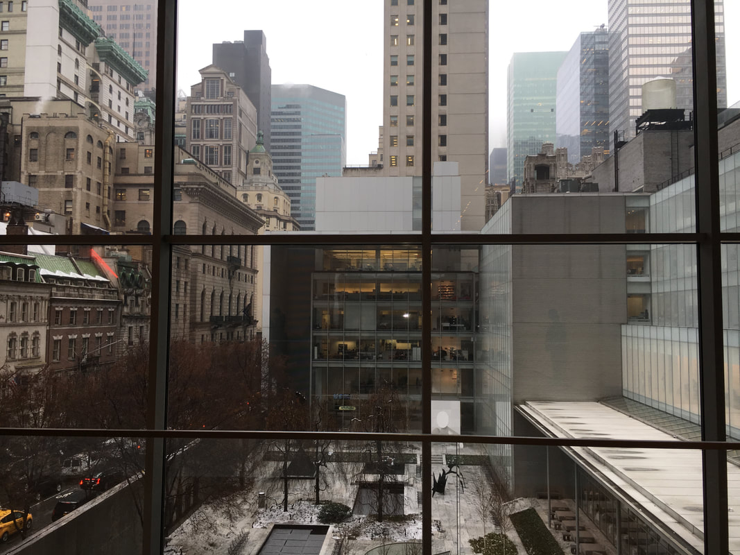 The Flat Iron Building 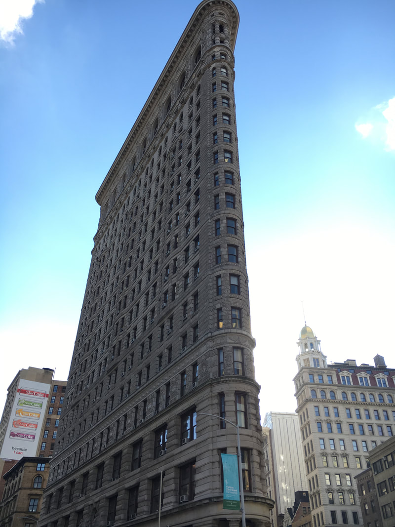 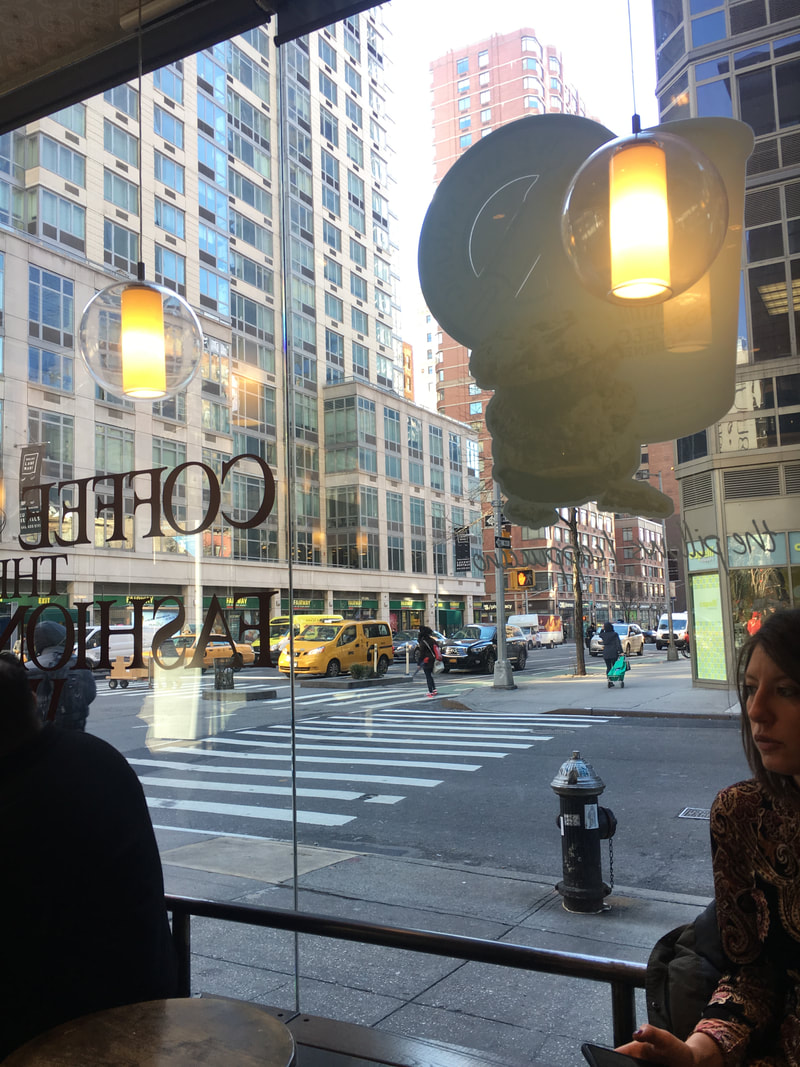  Central Park   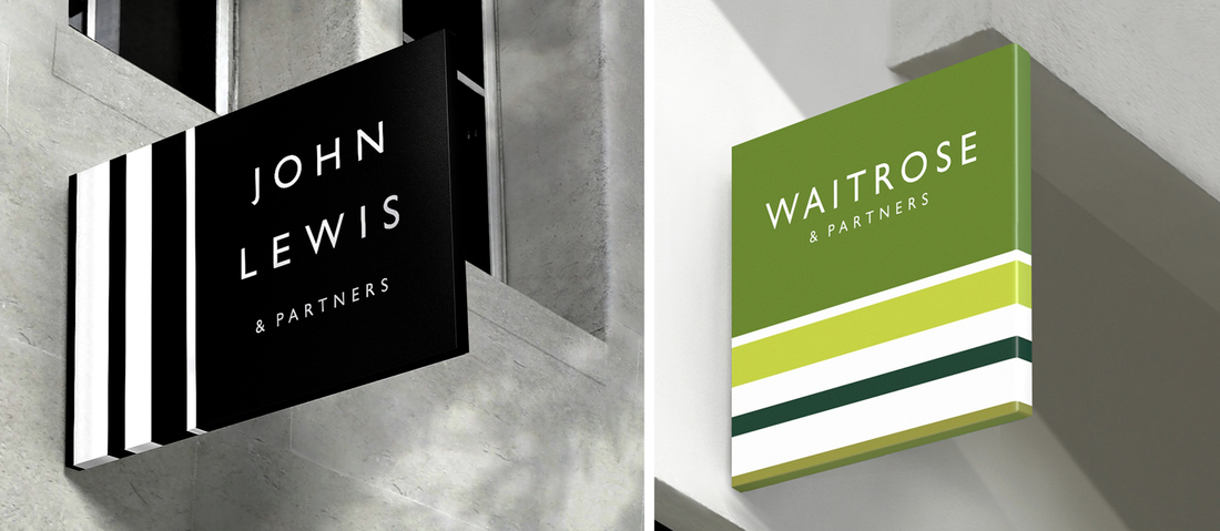 Pentagram's rebrand for John Lewis and Waitrose was rolled out this week and as I used to work for John Lewis and like branding/design, it is something that really intrigued me. Pentagram is the world's largest independent design consultancy firm based in London, New York and Berlin. It is run and owned by 21 designers, who are all specialists in their own field. Harry Peace is the designer who undertook the JL project, which took three years to develop, due to the sheer size of the rebrand. Pearce was interviewed by It's Nice That. He said that his new designs are 'complex, sensitive and authentic, it's the result of three years of detailed design thinking'. 'It's just got such an amazing history of design integrity' Pearce says, 'brands with integrity is a really attractive thing'. 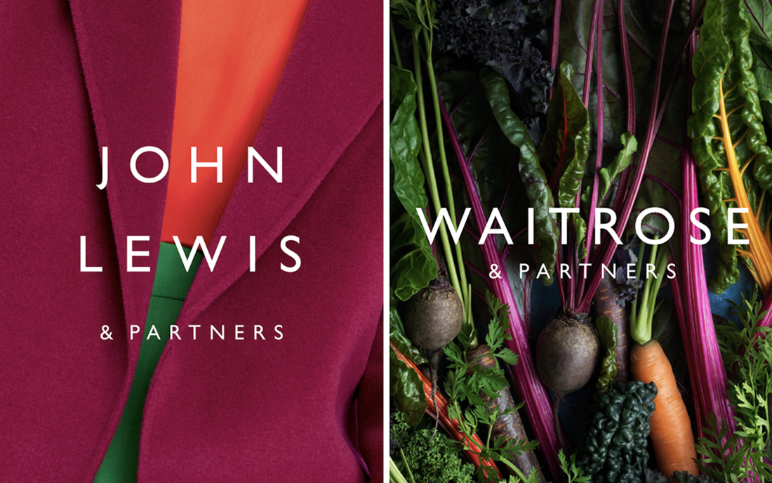 I really like this combination of text/photography, the use of bold and distinctive colours is really effective in my opinion. However, I would have liked it if they'd continued to use vibrant colours like this in the rest of the rebrand. Pearce spoke about the importance of using Gill Sans for the partnership, 'we've used inspiration from the past', 'Gill Sans is kind of British, isn't it?', 'It just seemed so natural and why change a good thing?' The rebrand included a new logo, advert (by Dougal Wilson), signage, uniforms and lorries. It was 18 years ago that the John Lewis Partnership (JLP) was last branded, a lot has changed in this time including the way retail works, social media and design. The unique thing about JLP is that it is owned by all of its employees, this is why it calls it's self a Partnership. Each staff member is called a 'Partner' and they all receive part of the profit in the form of a yearly bonus. This is something that Pearce wanted to highlight in the new branding, is the whole philosophy of the company and how it functions as a business with it's partners. This is evident from the slogan at the end of the new advert which reads 'when you're part of it, you put your heart into it'. Pearce says 'the philosophy of the company has been written into the logo', it now reads John Lewis & Partners rather than John Lewis. 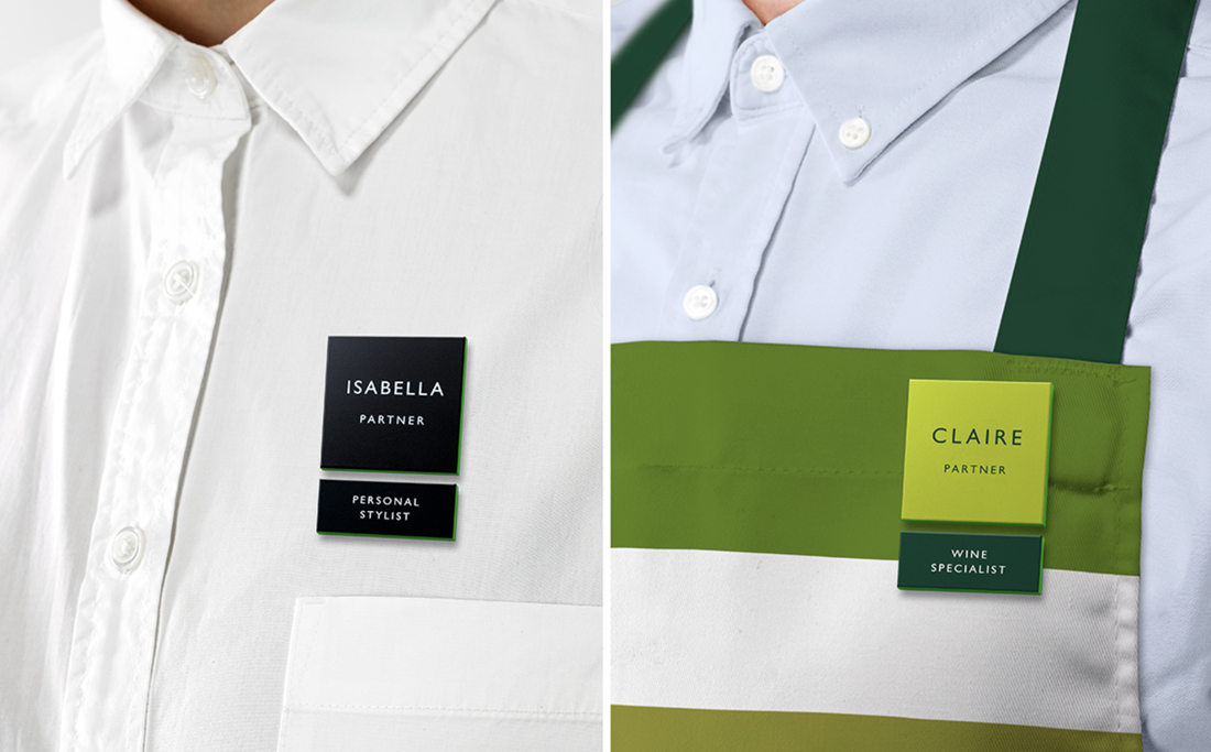 The new striped logo stems from Peter Hatch's design for JLP in the 1960's as seen below then Harry Pearce's new design below that.
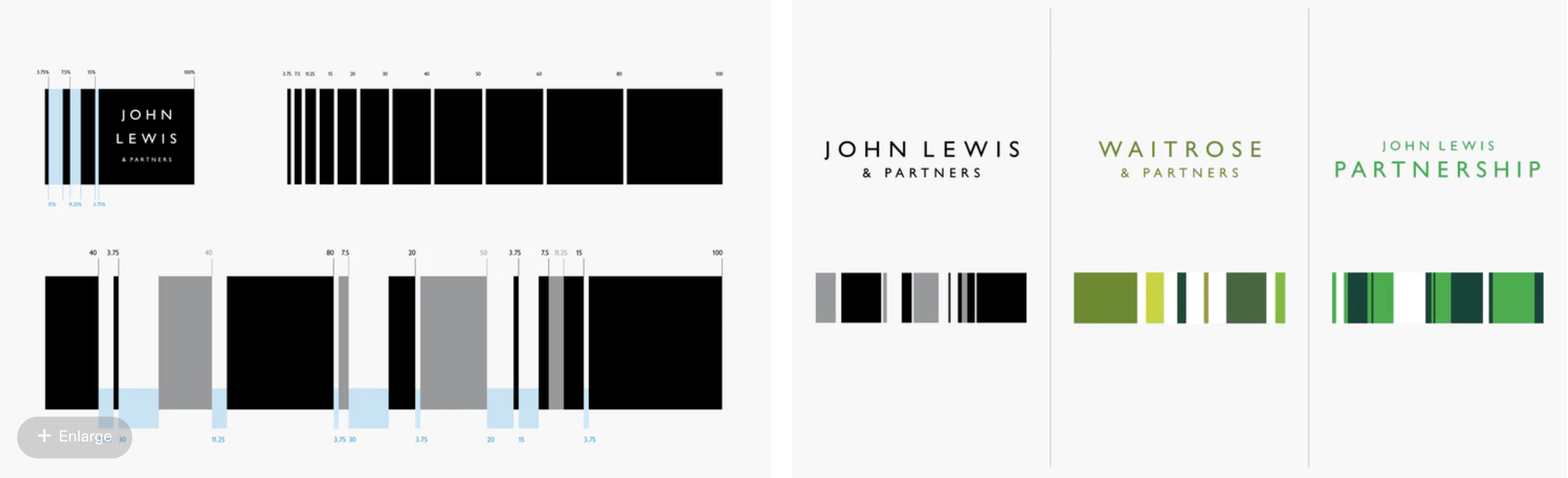    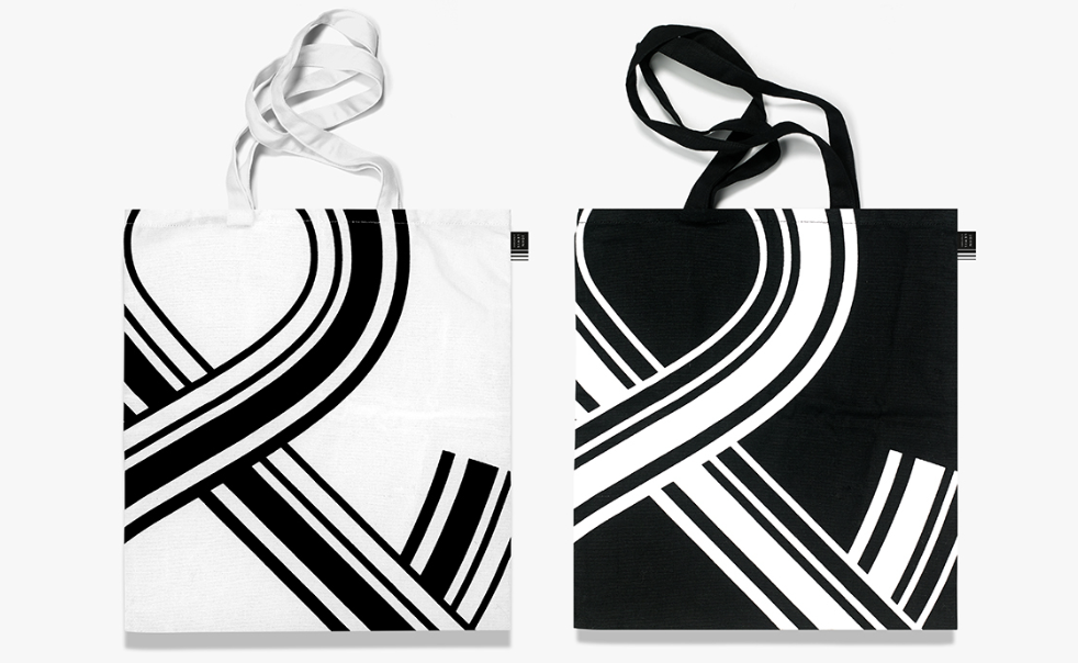 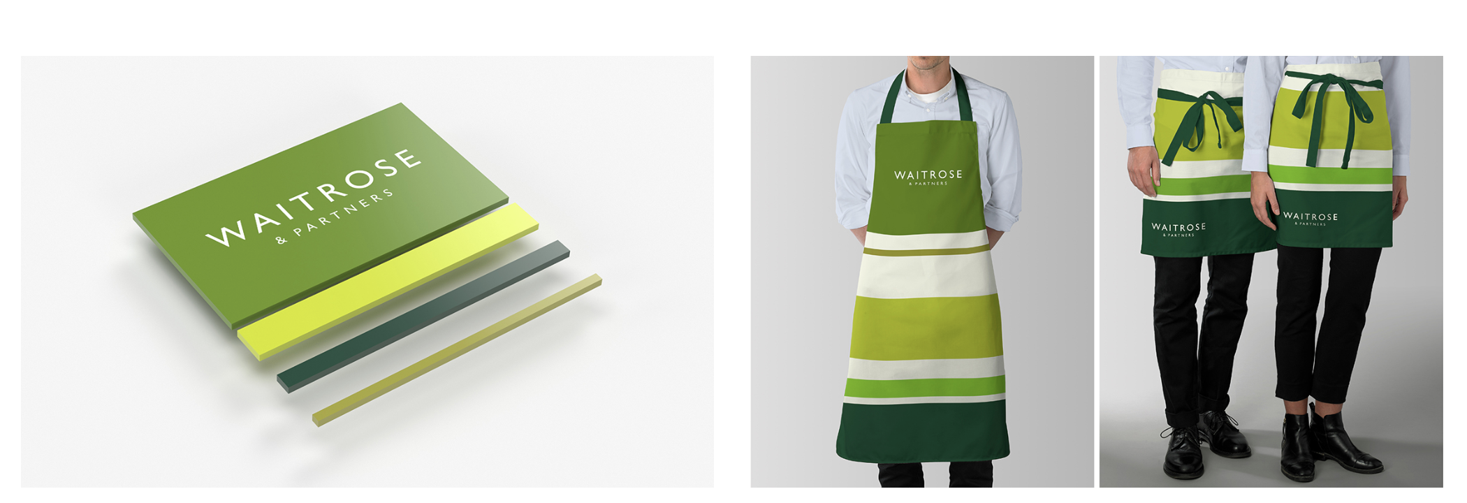 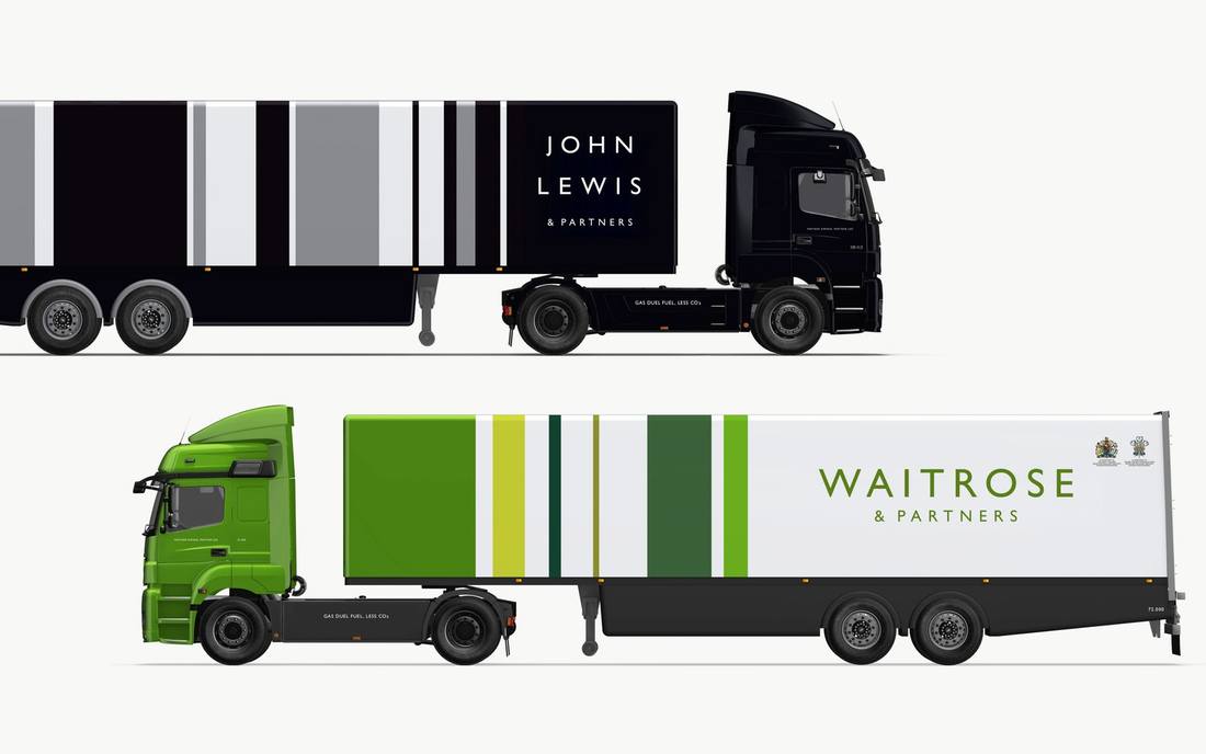 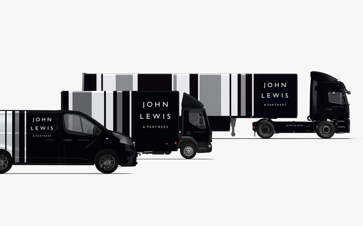  Personally, I feel that the new branding seems very plain. Pentagram is such an influential design agency, I'd hoped that they would have produced something a bit more exciting rather than using simple stripes in black and green, especially as they spent three years working on this. Even though these are the brand colours, I feel that it they could have been more creative with the project.
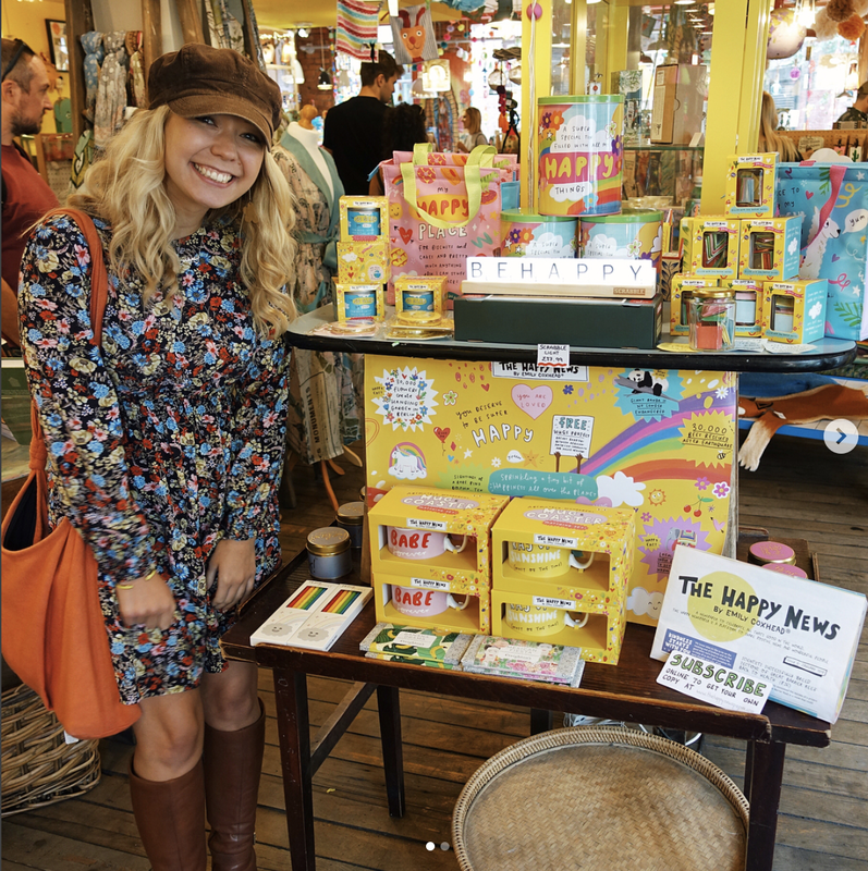
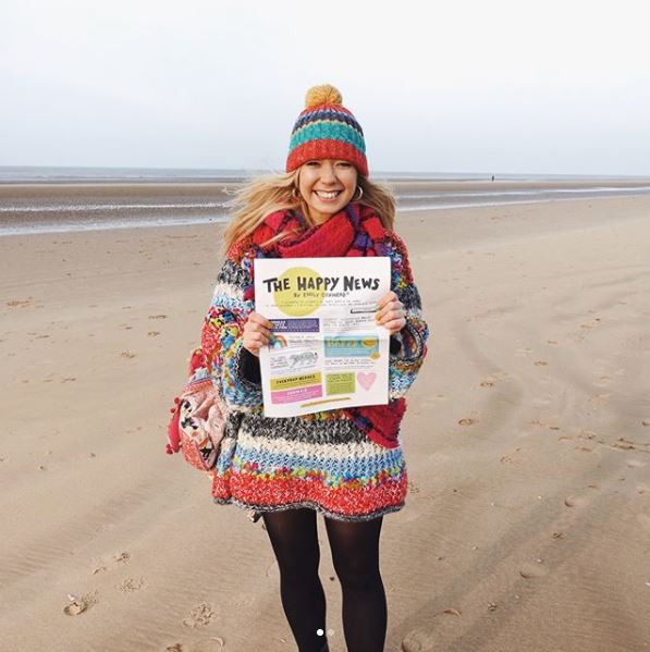
The new John Lewis advert www.youtube.com/watch?v=hOmZXG19Ets Quotes from www.itsnicethat.com/features/pentagram-harry-pearce-the-john-lewis-partnership-redesign-graphic-design-050918 Photos from www.pentagram.com/work/the-john-lewis-partnership www.eyemagazine.com/blog/post/type-tuesday38 For more inforation visit www.pentagram.com/ www.pentagram.com/about/harry-pearce www.johnlewis.com/ In a society that centralises around negativity and bad news, sometimes it is easy to forget to celebrate the good in the world. The Happy Newspaper is a paper that only reports on positivity and happiness. Emily Coxhead is a designer, illustrator and author, she created the whole concept of The Happy Newspaper herself. The first edition launched in December 2015 through a kickstarter campaign, it then resulted in reaching it's target of £500 in just two days! She describes herself on thehappynewspaper.com as the 'founder, director, creator, designer, illustrator, promoter and postman of ‘The Happy Newspaper’. But also cookie maker, author, photographer, tea drinker, greeting card designer and other happy-thing-maker.' Coxhead is just 24-years-old from a little village in Lancashire, Emily’s aim is to ‘sprinkle a tiny bit of happiness all over the planet’. I think that this is a beautiful thing that more people should aspire to do. The idea came about when Emily was going through a difficult time herself, she began to realise the very negative effect that the news was having on her and with the help of a little team she created The Happy News. Which is still being directed and designed in a tiny office in a little village in North West England. I think that this proves just how authentic both, Emily and this project still remain. Despite the growth and popularity of the newspaper and it's merchandise, which is now even being sold by the huge department store, John Lewis. For me, it is really inspiring to see how a young female designer/illustrator can be so successful and spread so much happiness into the world just by by using her bright personality and artistic talent. 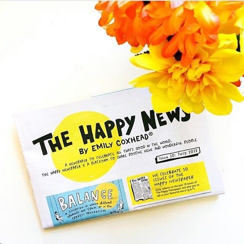 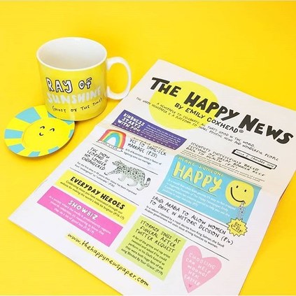 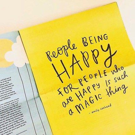 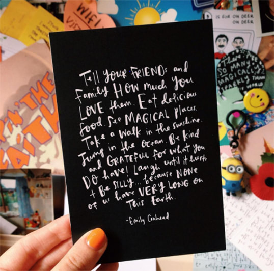 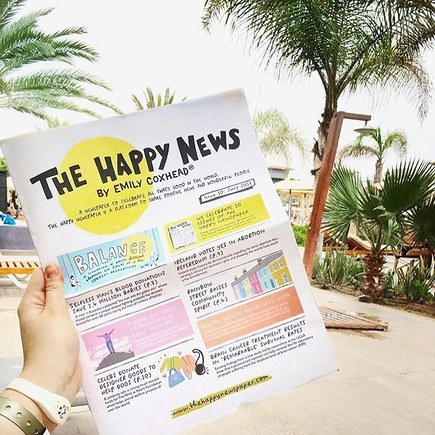  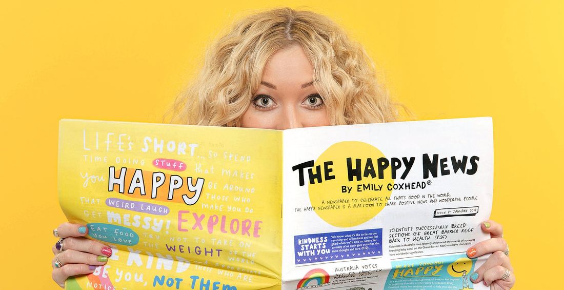
For more information visit thehappynewspaper.com/
www.emilycoxhead.com/ Images from www.instagram.com/emilycoxhead/?hl=en www.instagram.com/thehappynewspaper/?hl=en Quotes from thehappynewspaper.com/ 'A small piece of Italy in the centre of Moscow' 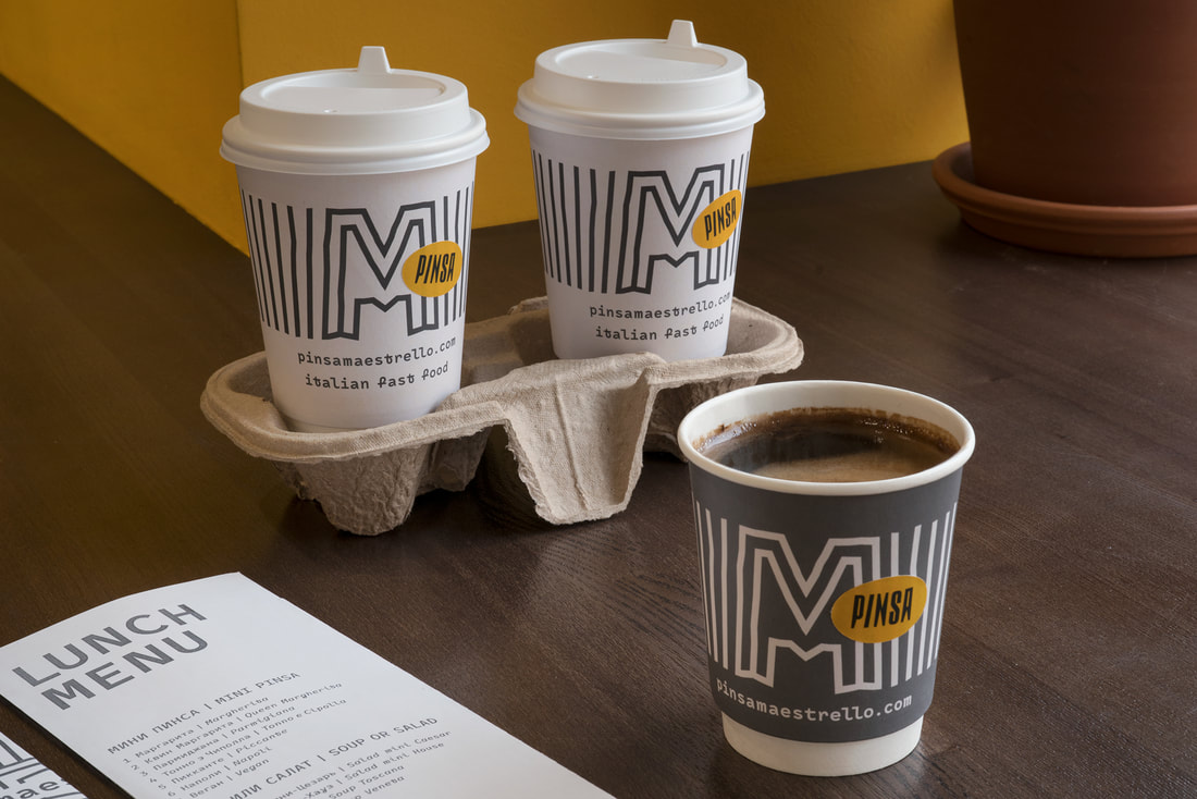 Pinsa Maestrello is an Italian fast food restaurant in Moscow, created by three Italians. Design by - Arthur Lebsack in collaboration with Anna Alyamova. They looked very closely at combining interiors with graphics. The concept of the restaurant is 'fast and casual', high quality food with speedy delivery and the design follows this approach. 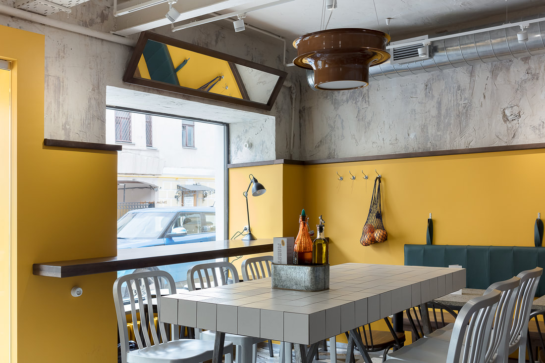 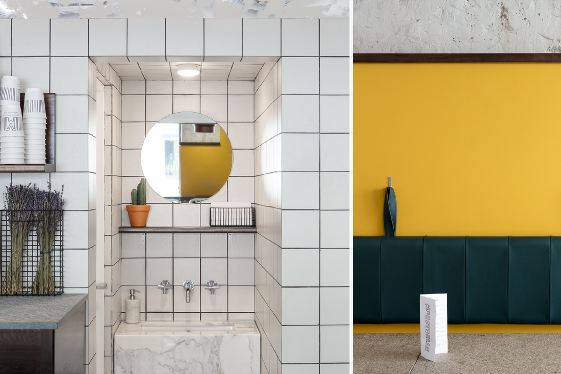 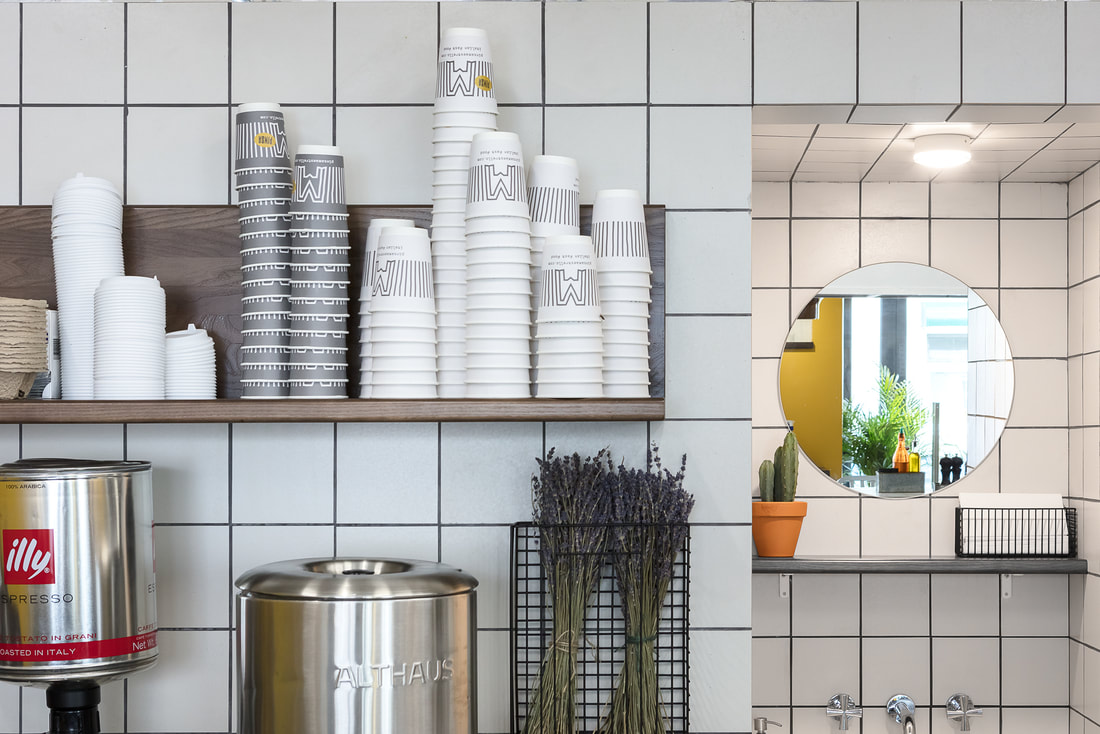 The interiors feature vibrant yellow walls, contrasted with bare and rustic looking wall and modern statement furniture. 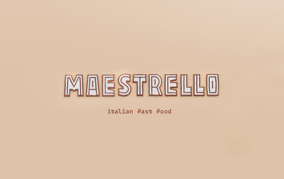 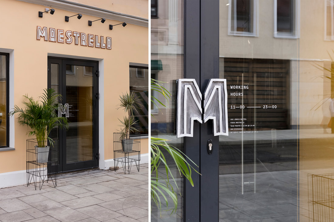 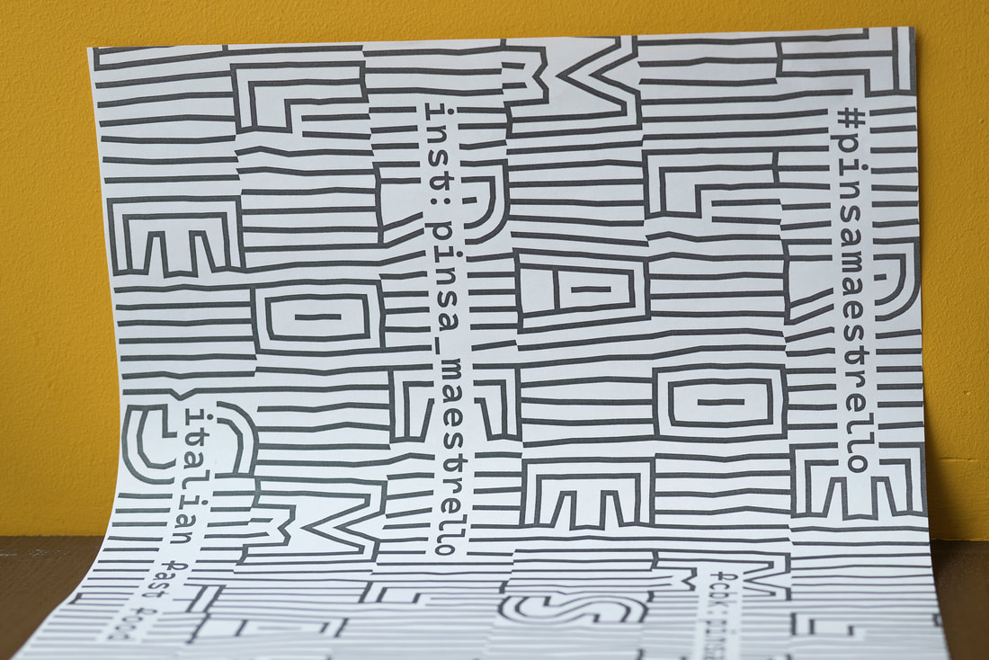 What I like the most about this design is the vibrant yellow contrasted with the grey and the way that the designer uses type to create a modern and beautiful corporate identity. 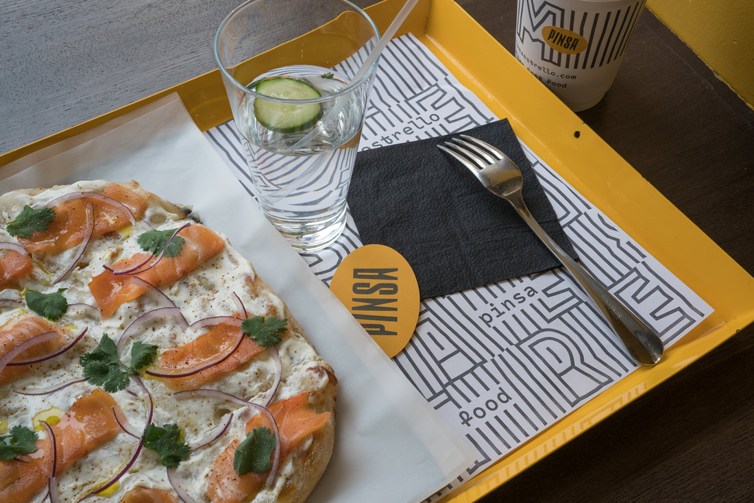 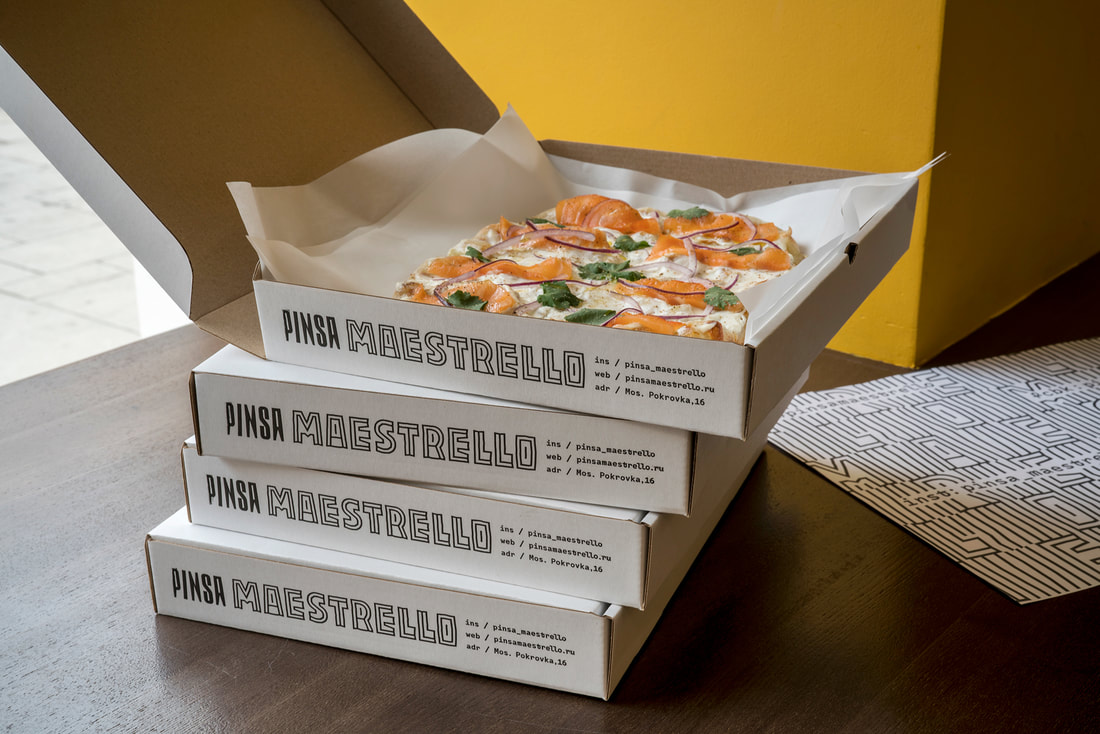 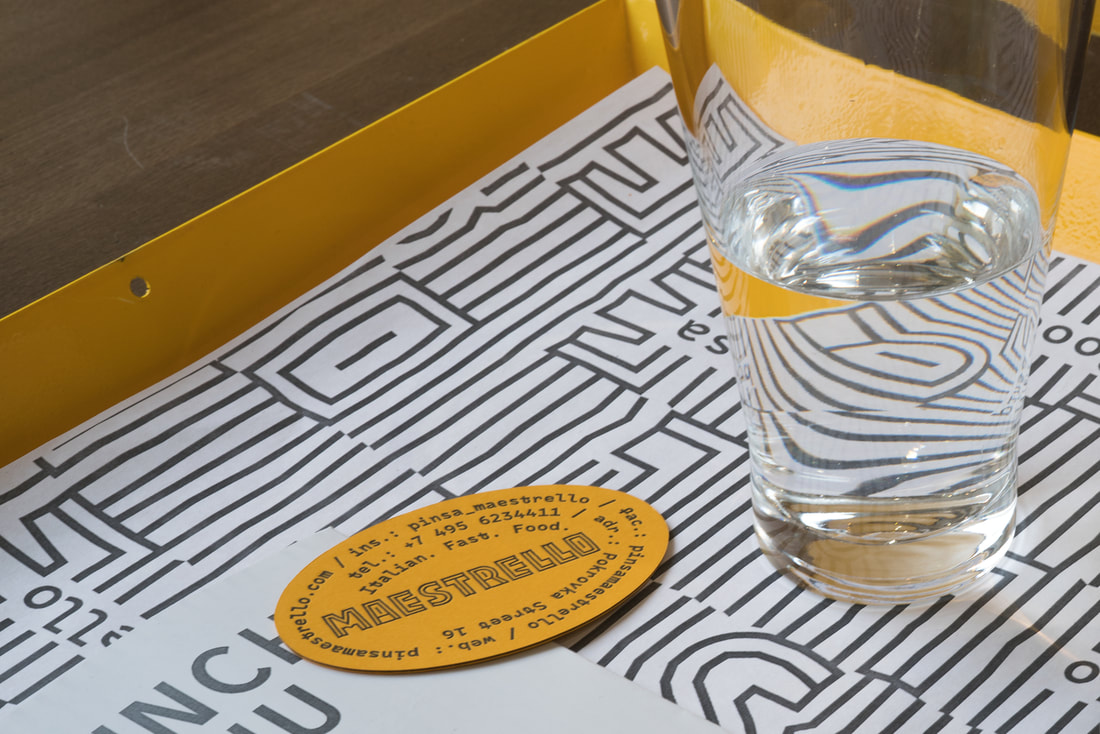 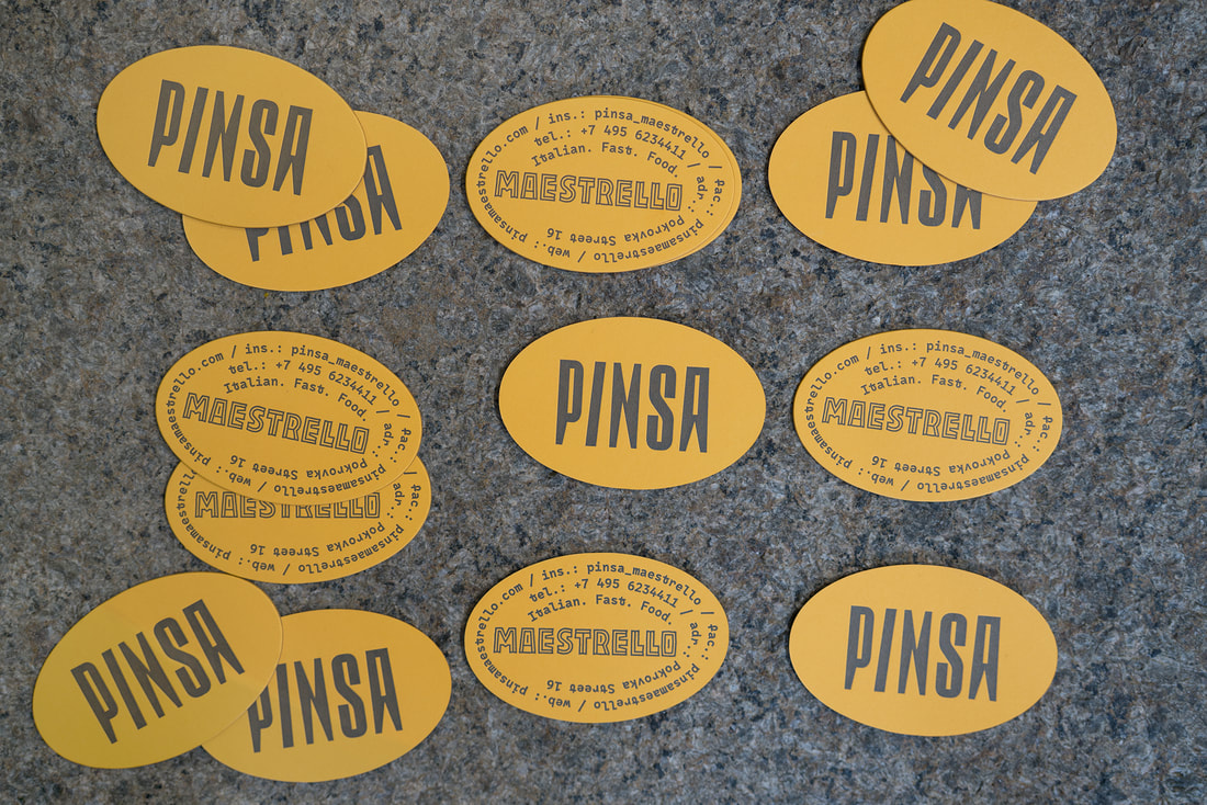 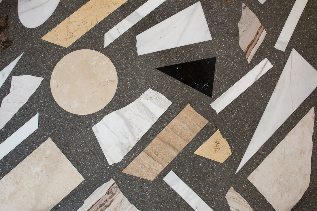 Source: https://www.behance.net Arthur Lebsack. License: All Rights Reserved
http://pinsamaestrello.com/ https://fontsinuse.com/uses/20407/pinsa-maestrello |
About me
I am a Graphic Designer and graduate from Nottingham Trent University. This blog is to document my work, inspiration and general things that interest me. Archives
February 2021
|